Every day, when you go out into the street, many cars of different brands, made in different countries of the world, pass by you. Each of them has a unique emblem on the grille and on the trunk lid -. Of course, this is not a chaotic design invention. Every combination of numbers, letters and symbols has a meaning.
Volga GAZ 21
Experienced designers have been working on any logo of a particular car brand for years, trying to reflect in it the history, traditions and many other nuances that are important for the owner of the company, thanks to which in the future this emblem will be associated with a reputable car brand.
Of course, the various stories associated with the names of a particular car are often directly related to the founders of the companies that produce them. Some of these names influence the exterior trim and serve as a starting point for the design of the emblem, a kind of identifying mark of the car.
The long history of the automotive industry has its own myths and legends. They are mainly associated with the history of the creation of a particular emblem (logo) of the car. Each of them has its own message from the past, and books and articles are written about the entertaining stories of the creation of the logo of a particular trade brand, as well as television programs are filmed.
In this article we will talk about 100 car emblems of the world with names and photos. We cover many countries and almost all continents and parts of the world. Are you ready for an exciting journey? Then buckle up. Go!
Australian
001 holden
The image of a lion in the name of the company dates back to the time when it was engraved on the threshold of the house at the end of the 19th century, at which time the company produced saddles and carriages. In 1928, the famous sculptor J. R. Hoff sculpted the sculpture "The Lion and the Stone". According to ancient Egyptian legend, a man invented the wheel when he saw a lion rolling a stone. The symbolic image of Hoff's sculpture formed the basis of the logo of the Australian company.

Emblem Holden
Asian
Indian
002 TATA Motors
The emblem of this most famous Indian car brand is somewhat reminiscent of the Korean trademarks of Daewoo and KIA, the same fonts, the same colors. In 1945, the first locomotives left the assembly line of the Indian plant, this was the beginning of the TATA company. And in 1954, the production of the first cars under the same brand began.

Iranian
003 Iran Khadro
The word “khodro” in translation means “fast-footed horse”, hence the head of the horse on the shield in the emblem of the Iranian car, which is very similar to the French model Peugeot 405. The company for the production of cars in 1962 was created by the brothers Ahmad and Mahmoud Khayyami.

Emblem of Iran Khodro
Chinese
The color scheme on the emblem of the Chinese car BYD is another example of plagiarism that has nothing to do with either the process of creating a model or its manufacturers. Look closely and you will see the resemblance to the BMW trademark.

BYD emblem
005 Brilliance
Of course, even the ignorant, it is clear that the name of this brand is translated as "diamond". By this, Chinese manufacturers wanted to emphasize the high quality of the goods offered. The trademark itself consists of a combination of two hieroglyphs that mean this word.

Brilliance Emblem
006 Chery
In 2013, Chery Automobile presented the world with a new modified logo. It looks like an oval with a diamond-like triangle in the center. According to comments Chinese manufacturers to the emblem of their cars, the sides of the triangle symbolize the main indicators of the company's work: quality, technology and development.

Emblem Chery
The emblem of this one of the oldest trademarks consists of two modified hieroglyphs, which are read as "first" and "car". The designers of this symbol claim that they conceived it in the form of a hawk spreading its wings in flight. This symbol is filled with pride in the success of Chinese engineering.

F.A.W. Emblem
008 Foton
Another example of imitation. Only in this case, the logo of the Chinese car brand is very similar to the well-known sports shoe brand Adidas. At the same time, Foton cars are among the three most significant auto brands in China.

Foton emblem
009 Geely
In April 2014, representatives of the Geely company announced the entry into the market of new cars with updated design logo. The new Geely emblem retains the design of its hybrid Emgrand concept, but has new colors - bright blue and black.

Emblem Geely

Emblem Geely Emgrand
010 Great Wall
For a long time, only small trucks were produced under this brand. Now Great Wall Motors is a powerful design and testing center located in the Baoding Industrial Park. The emblem features two capital letters"G" and "W". And the closed ring of the logo is a symbol of the Great Wall of China.

Great Wall emblem
011 hafei
Cars produced under this brand are inexpensive and are in demand among the general population. The logo looks like a shield, and the waves symbolize the channel of the Songhua River, near which the city of Harbin is located. It was in it that TM Hafei began its history.

Emblem Hafei
012 Haima
If we divide the name of this brand into two words "hai" and "ma", then connoisseurs will notice that the first word symbolizes the name of the province of Hainan, and the second the company "Mazda". Even the logo of this car is very similar to its Japanese prototype.

Haima emblem
013 Lifan
The emblem of TM Lifan is, schematically depicted, three sailing ships. The very name of the car in translation from Chinese means "to race at full speed."

Emblem
Malaysian
014 Proton
The logo of this Malaysian company initially looked like a crescent and a star with fourteen ends. In the late nineties, the updated car brand received a new emblem. Now it has the appearance of a tiger's head and an inscription with the name of the brand.

Proton emblem
Uzbek
015 Uz-Daewoo
In March 2008, Uzbekistan established joint venture GM Uzbekistan. It began to produce cars of the Uz-Daewoo brand. It is clear that the original logo of the popular Daewoo brand has not changed much. Only two letters were added to it in front. Last years the products of this Uzbek company were included in the list of ten best-selling brands in Russia.

Uz Daewoo Emblem
South Korean
016 Daewoo
The word "daewoo" means "big universe" in Korean. And the emblem of this popular brand from South Korea looks like a stylized sea shell.

Emblem Daewoo
017 Hyundai
The emblem of this famous South Korean TM looks very simple. This is the first letter in the company name - "H", written in a beautiful design style. But if you look into the dictionary and see the translation of this word, you will find out that literally it means “modernity”, “ new era' or 'new time'.

Hyundai emblem
This word literally translates as "the rise of Asia." The 3D logo symbolizes a young and energetic company. Red color is the warmth of the Sun, like aspiration upwards. An ellipse serves as a symbol of the Earth here, it emphasizes the global fame of the brand.

Emblem KIA
Japanese
019 Acura
In Latin, the syllable "Acu" means accuracy, reliability and accuracy. The logo contains the letter "A" modified in the form of a caliper. The purpose of this logo is to highlight the technical and design strengths of the Japanese brand.

Acura emblem
020 Daihatsu
The emblem of this Japanese brand looks like a stylized letter "D" and symbolizes convenience and compactness. For completeness, remember the company's slogan "We make it compact" and you will understand everything.

Daihatsu emblem
021 Honda
Deciphering the meaning of the Honda TM logo is very simple. Firstly, this is the first letter of the word, and secondly, this is the name of the founder of the company, Soichiro Honda.

022 Infiniti
During the initial work on the creation of the logo, the idea was to use the infinity sign, because in translation the word has exactly this meaning. But, then they made it in the form of a road going to infinity. This symbol has an underlying meaning of perfection in everything.

Emblem Infiniti
023 Isuzu
Everything is elementary, the logo looks like a capital letter "I" in a stylized version. But, wise Japanese, even in one letter they can find a lot of meanings. They interpret this logo and, especially, its color scheme as openness to the world and burning hearts of the company's employees.

Isuzu emblem
024 Lexus
The idea of the emblem belongs to the Italian designer Giorgetto Giugiaro. He did not like the first idea of the logo, which looked like a heraldic shield. He came up with the idea of bending in dynamics and placing the model's capital letter in an oval. In his opinion, this option symbolizes luxury.

Lexus emblem
025 Mazda
Starting in 1934, the logo of this car had six variants. The latter was recorded in 1997 and presented to the world along with the slogan "Zoom-Zoom". True to the spirit of the company, the capital letter "M" with wings symbolizes the ideas of freedom and flight. There is a legend that the grandfather of the founder of the company was a big fan of Chekhov and once got to the Moscow Art Theater for the play "The Seagull". Many years later, his grandson saw a seagull logo on an old program and decided to use it in his business.

Mazda emblem
026 Mitsubishi
The name of another popular Japanese brand has a secret meaning. Its name consists of two words "mitsu" - "three", and "hishi" - "water chestnut", it is also called "diamond-shaped diamond". The official translation of the word sounds like "three diamonds". And the company's logo combines the coat of arms of its founders, the Iwasaki family, which consists of a three-row diamond and a three-leaf crest of the Tosa clan.

Mitsubishi emblem
027 Nissan
The name of the company appeared in 1934 from the merger of two words meaning directly the country of manufacture, Japan, and its industry. The red circle on the company logo symbolizes the rising sun and a sense of sincerity. The blue rectangle is the symbol of the sky. This emblem fits perfectly with the company's motto "Sincerity brings success."

028 Subaru
Translated from Japanese, the word "subaru" can be translated as "pointing the way" or "gathering together", as well as a galaxy of stars in the Taurus Constellation. The emblem of the car, on which the six stars “shine”, has the meaning of high quality workmanship, the use of advanced technologies and wonderful driving performance cars.

Subaru emblem
029 Suzuki
The history of this logo is also insanely simple. The Latin letter “S” is stylized as a Japanese hieroglyph and is the first letter of the name of the founder of this TM, Michio Suzuki.

Suzuki emblem
030 Toyota
In 2004, the emblem of the well-known Toyota brand has undergone some changes. The manufacturers of this product promised their customers superior quality. Accordingly, the emblem should have been excellent. This is a three-dimensional image in color metallic silver, with three ovals, two of which are located perpendicularly in the center of the composition and symbolize mutual understanding between the manufacturer and buyers.

Toyota emblem
American
031 Buick
Emblem luxury car Buick has changed many times. In 1975, the name of the company returned to the logo, as it was at the very beginning of the production of this model. And when the company launched a new kind of machine called the Skyhawk, a hawk figure was added to the emblem. The Skyhawk ceased to exist in the late eighties, and the three coats of arms of the Scottish aristocrats and founders of the Buick family returned to the emblem.

Buick emblem
032 Cadillac
In 1999, the owner of TM Cadillac, GM, decided to make changes to the existing emblem. In order to make it modern in the coming 21st century, it was decided to remove the images of birds and crowns from it. It was decided to make the remaining coat of arms of the ancient noble family de La Mothe Cadillacs and the wreath framing it in the form of graphics. Piet Mondrian, an abstract artist from the Netherlands, was invited to work on the new emblem. Thus, on the verge of centuries, it turned out to connect the past and the future.

Emblem Cadillac
033 Chevrolet
There are several versions of the appearance of the emblem of this iconic car. One of them says that one of the founders of the company, William Durant, while visiting Paris, saw this drawing on the wallpaper of a room in a hotel and made it the logo of a new car. According to another version, Durant often painted various options emblems and eventually drew the same bow tie, which became the emblem of Chevrolet. And finally, the latest version is that Durant saw an advertisement for a coal company using this symbol in one of the newspapers and patented it for his business.

Chevrolet Emblem
034 Chrysler
The twists and turns in the history of the Chrysler car emblem are like a long-running Brazilian TV series. Behind last century his appearance changed a lot of times. For example, in 2007, it looked like a star with five rays. And in 2009 it was changed again, and now it looks like its name, posted on blue background with spread silver wings.

Chrysler logo
035 Dodge
The Dodge logo has changed many times during the 20th century. In 2010, it was decided to remove the ram's head from the emblem and make a simple inscription with the name of the company and two oblique stripes.

Dodge emblem
036 Eagle
The logo of this trade brand is a triangle with arc sides in the form of a coat of arms, inside of which there is an outline image of an eagle's head. The emblem is made completely in black with white contour lines.

037 Ford
In 2003, in honor of the centenary, it was decided to make small changes to the logo. The company reverted to the 1927 oval "flying letters" emblem, replacing only the color lining from purple to blue with iridescence.

Ford emblem
Company " General Motors Corporation" was formed in 1916. The founders of the company, the Grabowski brothers, were engaged in the production of trucks before the creation of GM. After William Durand joined them, the company took a new name and united the entire engineering industry Michigan. The emblem is nothing special and wins only due to the color scheme of red with a silver frame.

GMC Emblem
039 Hummer
Initially, this trademark of the General Motors SUV was intended for use in the army, a little later it began to be sold to civilians. There are no frills in the emblem. And why are they in the army?

Emblem Hummer
040 Jeep
Just like the Hummer, the car brand Jeep was made for military use and therefore no one paid much attention to the originality of its logo. In the beginning, it simply didn't exist. When the car was put on sale, a logo appeared, which is two circles and seven rectangles arranged vertically. This composition is visually similar to the front of an SUV.

Jeep emblem
041 Lincoln
The Lincoln logo is based on a stylized compass that simultaneously points to all directions of the world. At a time when this trademark was a huge success around the world, such a logo was appropriate. At the moment, demand for the company's products has fallen significantly even in the United States.

Lincoln emblem
042 Mercury
Not so long ago, a stylized letter "M" appeared in the logo of the automotive brand Mercury. And in 1939, the son of Henry Ford Edsel came up with the name of the new car in honor of the patron god of trade, the god Mercury, and depicted his profile on the emblem of the car.

Mercury emblem
043 Oldsmobile
The last of the existing emblems of the now defunct company was made in the Japanese automotive style, characterized by simplicity and conciseness. It looked like a stylized letter that "breaks" through the oval frame in which it is located. The emblem was intended to symbolize the technological modification of the model, which is able to compete with similar car models from Europe and Japan. There was also a slight “nod” towards the old logo, in the form of a hint of a rocket inside the emblem.

Emblem Oldsmobile
044 Plymouth
In 2001, this brand ceased to exist. And until that moment, its logo looked like the Mayflower ship, with the help of which its discoverers sailed to America, moored at Plymouth Stone.

Plymouth emblem
045 Pontiac
At the beginning of the existence of this car, its emblem was an Indian headdress. In 1957, its appearance was changed, and it became like a red arrow, which is visually located at the place where the radiator bifurcates. Unfortunately, this brand of American car died a long time.

Pontiac emblem
This car from the Chrysler Group LLC has a crested logo with the head of a hardhorned ram placed in the middle of the emblem. The whole composition is made in the color of metallic silver with a shimmer.
RAM emblem
047 Saturn
Another car from the "retired" category. On its emblem there is an image of the planet Saturn with rings. The inscription on the emblem is made in the same font as on the Saturn-5 launch vehicle that took the Americans to the moon.

Saturn emblem
048 Scion
For this brand, the logo was invented by California designers. It is based on the letter “S” in the form of exposed shark fins, since this car was originally intended for lovers of extreme sports and ocean fishing. The word "scion" is translated as "heir".

Scion Emblem
European
English
049 Aston Martin
The logo of the first James Bond's favorite car appeared in 1921 in the form of the letters "A" and "M", which were inscribed in a circle. Company founder Lionel Martin gave his brainchild the second part of the name, and the first part was taken from the town of Aston Clinton in England, where the car won its first race. In 1927 wings were added to the existing emblem.

Aston Martin emblem
050 Bentley
Open wings, symbolizing speed, independence and strength, are successfully inscribed into the TM Bentley logo. The letter "B" is placed in the middle of the composition, in honor of the founder of the company, Walter Bentley. The background on which the letter is located is very important. The green background is for racing cars, red is for models with a delicate taste, and black means power and strength.

Bentley emblem
051 Caterham
The emblem of this TM at the beginning of its creation had a striking resemblance to the logo of the Lotus car. The magic number 7 was on the logo quite for a long time and has been associated with the Caterham Super Seven brand. In January 2014, a completely new logo appeared, featuring the traditional green color and the outlines of the UK flag.

Caterham emblem
052 Jaguar
It is clear that the symbol of this machine is a well-known feline animal. So a car with that name should have power, beauty and grace. A sketch of a jumping jaguar was drawn in 1935 by the head of advertising and sales of Swallow Sidecars and showed the drawing to sculptor Gordon Crosby. And he blinded such an elegant figure of a jaguar in a jump. There was a time when savvy car dealers would sell this figure to car buyers for a surcharge.

Jaguar emblem
053 Land Rover
"Land" is the earth, "Rover" is the wanderer. A car that travels the earth. This is the main essence of this wonderful SUV. It's been over 60 years since Maurice Wilks came up with this name for his all-terrain vehicles. There are two types of TM Land Rover emblem. The first looks like silver letters on a black background, the second looks like gilded letters on a green background.

Land Rover emblem
054 lotus
The logo of TM "Lotus" is a bright yellow circle resembling the sun, and a British Racing Green triangle inscribed in it. The name of the car brand and the initials of its creator Anthony Colin Bruce Chapman (ACBC) are inscribed in the triangle.

Lotus emblem
Apparently, the designers did not sweat for long over the creation of this brand name. The brand name is simply inscribed inside a regular octagon.

MG Emblem
056 MINI
It is one of the "soaring" trademarks with wings that traditionally mean agility, speed, strength and freedom. And black is strong in innovation, dynamics, elegance and perfection. And what about without the silver color with its sophistication and grandeur. No way!

Emblem MINI
057 Morgan
Apparently the favorite representatives of the fauna in the UK are birds. Another "winged" logo with a cross-shaped emblem on the background of a circle and the inscription Morgan has a small company from England "Morgan Motor Company", which produces retro-style sports coupes with the most modern "insides".

Morgan logo
058 Noble
The emblem of this trademark flaunts the name of Lee Noble, who was the main designer and led the Noble company from 1996 to 2009. Now the company is engaged in the production of sports cars with high speeds.

Noble Emblem
059 Rolls Royce
There are two emblems of this famous car. On the first are the double letters RR. These are the names of the founders of the brand, Sir Henry Royce and Charles Stuart Rolls. There is a version that the color of the letters from red to black was changed immediately after the death of Sir Henry Royce in 1933. Another symbol of this car, which is placed on the hood, is a figure of a woman soaring, as if taking off, with a fluttering dress. This figurine is sometimes referred to as the "Spirit of Rapture".

Rolls-Royce emblem
This car owes its birth to two British engineers - Trevor Wilkinson and Jack Pickard, who in 1947 formed the company "TVR Engineering" and gave it the name of Wilkinson - TreVoR. The company specializes in light sports cars.

Emblem TVR
061 Vauxhall
The emblem of this oldest British car brand flaunts the image of a griffin - a mythical creature with the body and head of a lion and eagle wings. The name TM comes from the area on the south bank of the Thames.

Vauxhall emblem
Italian
062 Alfa Romeo
In 1910, draftsman Romano Cattaneo was waiting for a tram at Piazza Castello station in Milan. Suddenly he turned his attention to the image of the red cross on the flag of Milan and to the emblem that flaunted on the facade of the house of the noble Visconti family. The emblem depicted a snake that swallows a person. Over time, he combined the cross and the snake. The result is the logo of a famous automotive brand. In 1916, the word Romeo was added to the first name, in honor of the Naples entrepreneur Nicola Romeo, who became the new owner of the company.

Emblem Alfa Romeo
063 Ferrari
The prancing horse on the emblem of this TM was first placed on aircraft piloted by Francesco Baraka during the First World War. In 1923, Alfa Romeo driver Enzo Ferrari and Barack's parents met. They invited the racer to place a picture of a prancing horse on his racing car as a symbol of good luck and in memory of their son. Ferrari did just that, adding the official yellow color of his hometown of Modena to the drawing, and lifting the horse's tail up.

Ferrari emblem
064 fiat
In 2007, after Fiat had won the World Car of the Year title for the eighth time, it was decided to change its logo. From the old sample, the red color and the shape of the shield have been preserved. 3D shape and color features have been added. They symbolize the development of advanced technologies in production, the peculiarities of Italian design, dynamics and individualism.

Fiat emblem
065 Lamborghini
This emblem was invented by the founder of the company, Ferruccio Lamborghini. He placed the bull on the emblem because he was born under the zodiac sign of Taurus. According to legend, Lamborghini simply copied the shield of the Ferrari brand, and changed the yellow and black colors in places.

Emblem Lamborghini
066 Lancia
In 1911, the first logo of this Italian car brand was created. It looked like a four-spoke steering wheel with an accelerator handle, which is under the flag and brand name. This emblem was designed by Carlo Biscaretti di Ruffia. In 1929, he proposed placing the emblem on a triangular-shaped shield. Over time, the shape and color of the emblem changed, various elements appeared and disappeared, but the basics of the logo, invented in 1929, have survived to this day.

Lancia emblem
067 Maserati
This company was founded in 1914 in the city of Bologna and specializes in the production of sports cars and business class cars. The logo features a trident, which is one of the elements of the Neptune Fountain in the company's hometown.

Maserati emblem
068 Bugatti
The logo of this old Italian brand was created by its founder Ettore Bugatti. This is an oval-shaped pearl, studded with pearls around the edges. The fact is that Ettore's father, Carlo Bugatti, was engaged in jewelry design. In honor of his father, Ettore came up with the logo. In addition, inside the logo you can see the initials of the founder of the company "E" and "B". The red color of the emblem embodies passion, excitement and energy, black - masculinity and the pursuit of excellence, and white refers us to the concepts of nobility, purity and elegance.

Emblem Bugatti
Spanish
069 SEAT
The gray capital letter "Sociedad Española de Automóviles de Turismo" and the brand name of the car in red form the basis of the new SEAT emblem. It began to be produced in 1950. In those days, there were only 3 cars per 1000 inhabitants of Spain.

Emblem SEAT
German
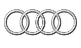
070 Audi
The emblem of this car can be conditionally called the “sign of four”. The four rings on the car's logo represent the conglomerate of four previously independent companies, Audi, DKW, Horch and Wanderer, which merged in 1932.

Audi emblem
In 1917, the first version of the famous TM BMW was created, which looked like a rotating propeller. The logo was full of small details and in 1920 it was decided to change it. The circle from the propeller was divided into four components with alternating light silver color and shades of blue skies. Plus, blue and white are the basis of the flag of Bavaria.

BMW emblem
072 Volkswagen
In German, this word means " people's car". In 1934, its release was sanctioned by the leaders of the Third Reich. In 1945, the German military authorities took over the management of the company. The city where the cars were produced took the name Wolfsburg and its coat of arms became the first Volkswagen logo. It depicted the Wolfsburg castle and the figure of a wolf. For the export version of the car, the letters “V” and “W” appeared in the logo.

Volkswagen emblem
Manufacturer luxury cars Maybach decided to include two large "M" on its logo, which originally symbolized the company "Maybach Motorenbau", and now have a new meaning "Maybach Manufaktur".

Maybach emblem
074 Mercedes-Benz
The brand emblem of the famous German manufacturer was registered on March 26, 1901. The meaning of the three-ray star is that the engines produced by the company are suitable for use on land, sky and water. For the first time, this star is mentioned in a letter from the founder of the company, Gottlieb Daimler, which he wrote to his wife. He implied that the star would point to the place where the new Daimler house in Deutz would be built and it would be located on top of the roof of his new car factory, symbolizing the success of the company. Daimler's sons decided to use this symbol in the emblem of the new car.

Emblem Mercedes-Benz
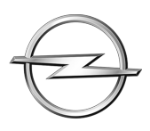
075 Opel
In 2002, Opel decided to make its logo more vibrant and dynamic. The lightning was replaced by a large three-dimensional sign, and the name of the company has shifted down.

Opel emblem
076 Porsche
The car was named after Dr. Ferdinand Porsche. The rearing horse was taken from the coat of arms of the city of Stuttgart, and the appearance of horns, red and black stripes on the emblem is due to the coat of arms of the Kingdom of Württemberg, in which Stuttgart was the capital. This logo appeared on the car in 1952.

Porsche emblem
Of course, it will not be difficult for English speakers to translate the word “smart” as “smart”. But, things are different. This word has parts of three other words: "Swatch" (the most famous Swiss watch brand), "Mercedes" (the current owner of the brand) and "Art" (art). At the beginning of the emblem is the letter "C", which means the compactness of the car and the arrow, hinting at avant-garde thinking.

Emblem Smart
078 Wiesmann
Models of this automobile company are called "exclusives". This is also hinted at by the lizard, which is placed on the hood of the car. It symbolizes speed, extravagance and wealth.

Wiesmann emblem
Polish
The abbreviation of this Polish brand comes from the name of the Car Factory (Fabryka Samochodow Osobowych). It was founded in 1951. There is a legend that in 1684 the world's first scooter was developed, which was powered by rocket engine. Then the literal translation of the emblem sounds like Special Scooter Factory. In the emblem, the letter "F" consists of part of the letter "S" and is outlined by the letter "O". And red is a manifestation of passion, quality and trust.

FSO Emblem
Russian
080 VIS
The emblem of the company "VAZinterService" is a graphic style using the letters "B", "I" and "C". This is a subsidiary of AvtoVAZ, which specializes in the production of pickup trucks for various purposes.

WIS emblem
081 GAS
The Gorky Automobile Plant produces Volga and Chaika cars and several types of trucks. The logo of the plant was made public in 1950 and had a great resemblance to the coat of arms of the Nizhny Novgorod Principality. A prancing deer is placed on the emblem. Over the years, the image of the logo has undergone changes.

Emblem GAZ
082 ZIL
This famous Russian brand has a fairly simple logo with stylized letters. It was invented in 1944 by the body designer I.A. Sukhorukov for the ZIL-114 model. The head of his department liked the emblem, and he handed it over for approval to the top management of the plant. Likhachev.

Emblem ZIL
083 Izh
In 2005, the production of cars under this name ceased. The plant from Izhevsk became the property of the Russian Technologies company. And the old logo was a combination of two unfinished hemispheres with oblique rounded white lines in the middle of the logo, symbolizing the letters "I" and "Zh". As well as a stylized inscription "AUTO" under the emblem.

Emblem IZH
084 Lada
In 1994, the emblem of the Russian model Lada appeared in the form of a white boat under a sail on a blue background. The logo was updated by the chief designer of AvtoVAZ, Steve Mattin, who previously headed the design department of Volvo. This emblem alludes to the location of the plant in the Volga city of Samara. A long time ago, the boat was the main vehicle for transporting merchant goods along the Volga. On the logo, the letter "B" is drawn in the form of a boat.

Emblem Lada
085 Moskvich
The Moskvich logo has undergone changes many times. But, the image of the Kremlin, symbolizing Moscow, was always clearly visible on it. The last emblem of this car looks very plain. The contours of the battlements of the Kremlin wall are connected with a stylized letter "M".

Emblem Moskvich
086 Oka
The emblem of this Russian passenger car looks like stylized capital letters of the word "Oka". This brand was launched in 1988. IN Russian Federation at the KamAZ plant they produce Oka with the letter K, AvtoVAZ produces the Lada Oka-2, and SeAZ launched the production of Oka with the letter C.

OKA emblem
087 UAZ
In 1962, the well-known “circle with a swallow” became the emblem of the Ulyanovsk Automobile Plant. At the beginning of the new century, the name began to be written in Latin letters, and the company changed its logo. Now it is green and with changed forms.

Emblem UAZ
Romanian
088 Dacia
The company from Romania came up with the emblem of their car based on a blue shield with the name of the manufacturer written on it. Then the emblem became even simpler. This time they did without a shield. Only the silver-colored emblem remains, which bears the name of the company.

Dacia emblem
Ukrainian
089 Bogdan
The Ukrainian car "Bogdan" has a logo in the form of the Latin letter "B", which looks like a sailboat with inflated sails. It is a symbol of good luck and success, a fair wind while traveling. The letter is placed in an ellipse on a green background. Green color means the processes of growth and renewal, the gray color of the letter and ellipse hints at perfection.

Bogdan emblem
090 ZAZ
The emblem of the Zaporozhye Automobile Plant has been changed. Previously, it depicted the Zaporizhzhya hydroelectric power station, at the top of which were the letters ZAZ.

ZAZ emblem
Czech
091 Skoda
The emblem of the famous Czech car in the form of a "winged arrow" appeared in 1926. For 5 whole years (1915-1920) Mr. Maglie worked on this logo. As a result, he got a stylized head of an Indian, which is worn with a headdress with a round clasp and five feathers.

Skoda emblem
Swedish
092 Koenigsegg
This Swedish company produces exclusive sports class products. It was founded in 1994 by Christian von Koenigsegg. The logo is made in the form of a shield with diamond-shaped lines in orange and red.
![]()
Emblem Koenigsegg
093 Saab
The logo of this company is an image of a griffin, which has the body of a lion, as well as the head and wings of an eagle. They took it from the logo of the Vabis-Scania company, which produced trucks, after its acquisition by the Saab concern. The logo is very similar to the emblem of TM Scania.
![]()
SAAB emblem
094 Volvo
The word "volvo" is translated from Latin as "I roll." The main composition of the logo was the ancient symbol of iron. In ancient Rome, he was closely associated with the god of war, Mars, who used only iron weapons in battles. And iron is a symbol of durability, reliability and high quality.
![]()
Volvo emblem
French
095 Aixam
The French company for the production of subcompact cars was formed in 1983. Its logo is very simple and clear. It is a capital letter "A" on a blue background, inscribed in a circle with a red stroke. At the bottom is the name of the company, written in capital letters, directed towards the center.

Aixam Emblem
096 Matra
Under this brand, in addition to cars, aerospace equipment, weapons systems, bicycles, and telecommunications equipment were also produced. The logo consists of the name of the company in black capital letters and a circle with black and white stripes, inside of which there is an arrow pointing to the right.

Matra emblem
097 Peugeot
Sometimes the owners of this car affectionately call it a "lion cub". At the beginning of their career, the founders of the company, the brothers Jules and Emile Peugeot, were engaged in the manufacture of cutting tools. And in this case, the lion was a symbol of flexibility, speed and strength. And now, after a while, this symbol migrated from the surface of the saw to the surface of the car. At first, the lion seemed to be walking along the arrow, but then it was reared up.

Peugeot emblem
098 Renault
This company had many logos. The most famous is the vertical rhombus, which appeared in 1925. In 1972 and 1992, it was radically changed. In 2004, a yellow background appeared on the emblem, and in 2007, RENAULT was added at the bottom.

Renault emblem
099 Simca
The logo of the now defunct French car Simca was an emblem base, divided into a blue and red background inside. Moreover, there was a third more red background than blue. In the upper blue part of the emblem there was a stylized image of a white swallow, and the name of the company was written in white elongated letters at the bottom.

Simca emblem
100 Venturi
The emblem of this TM looks like an oval bordered with a silver stripe and a red background inside. In the center there is an emblem-shaped triangle, inside of which there is a bird with outstretched wings, above it, along the upper contour, the name of the company is written in capital letters. The color background inside the triangle is dark blue.
Scanner for self diagnosis car
Determining the brand of a car by the badge on the hood is not always easy. The thing is that at the moment there are a huge number of manufacturers, each of which has its own unique history, emblem and logo. Some of them started their journey with completely different products and only after a few years (and in some cases even decades) switched to the production of cars.
In the article you can find emblems of cars of the world with names and get acquainted with their logos. The roots of logos go deep into history and have their own secrets and features. Let's take a look at the main car brands with icons and names.
Chinese car brands with badges and names
BYD
The company produces enough interesting cars focusing on the latest technologies. A special direction of development is electric vehicles. Instances of BYD, which operate on electric traction, compete quite successfully with the world's best representatives of this market niche.
Chery

This emblem stands out among the logos Chinese cars. It consists of the first three letters of the full name of the corporation - Chery Automobile Corporation. In addition, the designers put another meaning into this logo - the letter A (first class cars) and the hands that support it.
Geely
The corporation was established in 1986 and includes several brands such as Geely Englon, Geely Emgrand, and Geely Gleagle. There were a lot of interpretations of this word, but the people who stood at the base put the meaning of “happiness” into it. The attribute of the emblem, which is located in the middle part, according to one of the opinions, is a mountain, and the other is the spread wing of a flying bird.
Great Wall

Often, Chinese car brands, emblems and names have a deeply disguised meaning. However, in the case of the Great Wall, everything is extremely simple - this phrase is translated as "Great Wall". The company was founded relatively recently - in 2007 and puts patriotism and the use of the latest technologies in the automotive industry. Despite its young age, the concern has managed to establish itself as one of the best Chinese automakers. The emblem contains a tooth - a component of the Great Wall of China.
Lifan

The emblems of Chinese cars are very different from each other. For example, the Lifan logo contains three sails. The literal translation of the name means "To go with all sails." The concern, in addition to cars, also produces many different vehicles, such as buses, motorcycles, scooters and ATVs.
Japanese car brands with badges and names
Honda

The corporation got its name thanks to the name of the founder (Soichiro Honda). The emblem is a capital letter framed with rounded corners. Stylish, original and recognizable.
Infinity

Japanese car logos are varied. For example, the Infinity emblem symbolizes infinity. The original idea was to use the infinity sign, but later it was abandoned and they decided to perpetuate the road going into the distance on their logo.
Lexus

The Lexus logo stands out among the emblems of Japanese cars. It depicts the letter L, which is framed by an oval of the correct form. This combination symbolizes luxury, the status of which does not need to be proved once again. The expression "Lexus" sounds better than "Luxury". Lexus is a subsidiary of Toyota Corporation. Under this brand, premium cars are produced - convertibles, SUVs, sedans and executive cars.
Mazda
This company has an emblem consisting of the letter M and resembling a bird with outstretched wings. Quite often it is compared with a flower or an owl. The brand was named after the deity Ahura Mazda, who is the creator of the Sun and other stars. The concern is one of the world leaders and produces cars of various classes.
Mitsubishi

Among the emblems of Japanese cars, the emblem stands out in a special way. Mitsubishi. This manufacturer is part of the Mitsubishi Commercial Company, which produces both cars and trucks. The literal translation of the name from Japanese is “three diamonds”. It is they who are depicted on the coat of arms of Iwasaki, which became the prototype of the company's emblem. Since the company's inception, the logo has never changed.
Nissan

The logo of this Japanese brand is a rising sun, on which the brand name is written. The main motto of the company is "only sincerity brings real success." The Nissan concern was formed as a result of the merger of several companies and is one of the oldest in Japan. Of particular note is the world's most popular electric car– Nissan Leaf.
Subaru

Emblem of the Japanese manufacturer Subaru cars contains six stars that are located in the constellation Pleiades. In Japan, it is sacred. This constellation can be seen from Earth with the naked eye. The first cars that left the Subaru factories were based on Renault models. If you translate the name from Japanese, you get the expression "put together."
Suzuki

The Suzuki logo is a capital S in the form of a Japanese character. The name of the concern was due to the name of its founder - Michio Suzuki. After its foundation, the company produced motorcycles and machines for weavers, but already in 1973 the first car rolled off the assembly line. In just 20 years, Suzuki has become one of the world's leading car manufacturers, selling about 2 million cars a year.
Toyota

The logo of the Japanese brand Toyota contains a needle eye into which a thread is threaded. It was created over a hundred years ago when the company was engaged in the production of looms. In the 30s, there was a reorientation of production to cars, but the logo was decided to remain the same. This emblem has a deep meaning. The two ovals that intersect show the unity of the hearts of the driver and the car, and the large ellipse that unites them shows broad perspectives and possibilities.
American car brands. List with icons
Acura

The central part of the company logo is very similar to a caliper. In addition, you can see the capital letter of the group name in it. External rigor and simplicity shows the basic principles of the company - accuracy and simplicity. At the time the company registered this logo, it had problems with having very similar trademarks.
Cadillac
American name and logo Cadillac cars descended from the man who founded the city of Detroit - Antoine, seigneur de Cadillac. The logo contains his family coat of arms.
Chrysler
Often, the emblems of American cars are original. So, for example, the emblem of this car manufacturer is spread wings, symbolizing speed and strength. The company was named after its founder, Walter Percy Chrysler. He positioned the company's activities as a modernization existing technologies based
Chevrolet

Back in 1911, the director of the automobile concern General Motors made an offer to the racer Louis Chevrolet to become the face of the company and name the produced cars in his honor. There are several versions of the history of the company logo. According to one of them, Louis, having seen a drawing in a newspaper, decided to use it, modifying it a little. Another says that the layout was taken from a wallpaper pattern that was seen by the owner of the company in one of the hotels.
Ford
Ford is a very popular American automobile brand whose emblem consists of an oval containing the name of the company. The company was named after founder Henry Ford.
Jeep

Jeep is a subsidiary of Chrysler. The logo has a simple structure - the name of the company without unnecessary elements. The main specialization of the brand is the production of off-road vehicles.
Tesla

Tesla was founded by Elon Musk in 2006. Cars running exclusively on electric traction come off the assembly lines of Tesla factories. After 2 years, production became mass. The logo was developed based on the first letter of the name, which the company received in honor of the famous physicist Nikola Tesla. The Tesla Rodster model has an AC motor, which began to be developed back in 1882 by Nikola.
Korean car brands with badges and names
Daewoo
When literally translated from Korean, this name means "Great Universe". The main version of the origin of the emblem of the Korean brand is a seashell. However, there are alternative assumptions - for example, at the expense of the heraldic line, which represents greatness.
Hyundai

Hyundai Corporation was founded in 1967 and has acquired many traditions during its existence. In translation, the name sounds like "modernity". The logo is a handshake of two people, showing the friendship between the client and the automaker.
Kia

The emblem of the Korean company Kia is the name of the brand enclosed in an oval. Translated into Russian, it sounds like "Enter the world of Asia." The concern produces both cars and trucks, as well as buses.
German car logos
The most popular emblems of German cars are Audi (4 chrome rings that form a strict straight line), BMW (circle with traditional colors of Bavaria), Mercedes-Benz (three-pointed star), Opel (lightning indicating speed) and Volkswagen (monogram of letters, which form the basis of the names W and V).


French car logos
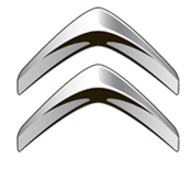
Main Emblems french cars are Citroen (parallel chevrons showing ascent), Peugeot (lion) and Renault (diamond, which symbolizes wealth and prosperity).


Among the logos of Soviet cars, the following can be distinguished:
Lada
(sailboat enclosed in an oval)

Volga
(gazelle symbolizing speed)

Every car that drives down the street proudly carries its “heraldic coat of arms” on its grille. Or the logo of the manufacturer. By the way, some emblems are indeed borrowed from the family coats of arms of those who are related to the creation of a particular brand. And some emblems were created "without further ado." Recognizable? Concisely? Informative? That's good.
Of course, it is unlikely that it will be possible to consider the icons of absolutely all car brands in this article, but about the origin and meaning of the “brand” on the hood of the most popular cars among the people - why not? History is always interesting and educational!
For convenience, the list of car brands in pictures can be viewed alphabetically.
So, each icon is a small digression into history…
The emblem of this Italian brand is a combination of images of two coats of arms. One image in the form of a red cross on a white background was part of the coat of arms of the city of Milan. The second image in the form of a bloodthirsty serpent devouring a person was borrowed from the heraldic coat of arms of the Visconti dynasty. Over time, the Alfa Romeo emblem has been slightly changed, but these two elements have been preserved in their original form.
Who is not familiar with the four famous rings intertwined with each other? In 1932, this symbol signaled to the whole world about the cooperation of four companies that merged into one automobile concern, Auto Union. The war ended the existence of almost all its participants, but " sign of four" remained. After the revival of Audi in 1965, he became the emblem Audi cars.
The circle, divided into four equal sectors and resembling a target, tells of the times when the BMW concern was engaged in aircraft construction. So this logo is nothing more than the rotating blades of an aircraft propeller. And the colors of the emblem are the main colors of the flag of Bavaria.
Among the emblems of American car brands, this one has the most interesting origin. At first, only one name was present in the logo: "Buick". Simple and tasteful. And then the Scottish automaker David Buick modestly added three shields from his family coat of arms to the inscription. Together with the inscription, they adorn the hoods of all Buicks to this day.
This cross, familiar to everyone, has nothing to do with coats of arms. According to rumors, the founder of the automobile company, William Durant, either saw a similar pattern on the wallpaper of a hotel room, or drew it on a napkin during lunch. And the car itself was named after the engineer Louis Chevrolet.
People like to call this brand “double chevrons”, which actually reflects the essence of the emblem: the teeth of a chevron wheel. Because Andre Citroen began his career as an automaker with them.
The appearance of this emblem was not accompanied by mysterious and family stories, so the designers depicted a sea shell as a logo. True, some see it as a lily.
These four companies preferred not to bother with ornate car brand badges, but depicted the main thing on the hoods of their brainchildren: just car names. And if in the first two the background and font periodically changed, then the emblems of Jeep and Hammer were initially unchanged and simple. Severe military guys - nothing more!
The creator of this brand, Soichiro Honda, did not even begin to write the name. He simply took the initial letter of his last name and enclosed it in a geometric figure. Today, this logo symbolizes quality, reliability and everything for which Japanese cars are so loved.
The emblem of these imposing travelers looks rather unassuming. Rumor has it that the oval with the name of the company inscribed in it is nothing more than an imprint tin can. A rough logo, but this does not prevent the car itself from being one of the favorites of the automotive market.
Lexus followed the same path: a capital "L" inscribed in an oval. The emblem is simple, but many people like it. Style, design, speed and high quality are far from complete list advantages of this car.
It is assumed that the three-pointed star on the Mercedes Benz logo was invented by Gottlieb Daimler as a child. The kid already then dreamed of success and mentally drew in his imagination that such an asterisk would decorate the roof of his own factory. A less romantic version claims that the three ends of the star symbolize the three founders of the Mercedes company. Or maybe both versions are true. Why not?
Until now, opinions also differ about the appearance of the emblem of cars. Mazda cars. Some believe that the logo depicts the coat of arms of Hiroshima. Someone sees on it the image of a tulip, personifying grace and softness.
"Mitsubishi" translates as "three diamonds", which symbolizes the logo. As a result of the combination of the coats of arms of two Japanese dynasties, three red rhombuses flaunt on the grille of Mitsubishi cars.
The emblem of this Japanese concern is now quite simple and concise. Initially, the circle personified the sun and was red. And the rectangle with the name of the company symbolically meant the sky, and the color had the corresponding one.
The lightning enclosed in a circle is dedicated to the compact truck of the Blitz brand. In translation - "lightning". For many years it sold very briskly on the market, which contributed to the further prosperity of the Opel company. By the way, the first products of this plant were not cars at all, but sewing machines and bicycles. And the cars came later.
Among brand logos french cars, the most recognizable is a rearing lion. The Peugeot company looked after it on the flag of one of the French provinces. By the way, she also started with bicycles. And the logo itself was repeatedly modified until it acquired the form that is known now.
Both concerns, without saying a word, chose the letters "S" as their emblems. True, the execution is different. This is probably why neither one nor the other is worried about the fact that someone can confuse them. But by the way, the letter in the Suzuki logo also resembles a hieroglyph. So, the Japanese are calm for the uniqueness of their emblem.
That's really whose emblem has undergone a lot of changes! The rhombus, symbolizing the diamond, at first was not a rhombus at all, but the initials of the three brothers. By the way, you will never guess what exactly Renault produced at the beginning of the twentieth century. Not bicycles or even sewing machines... but tanks! The tank was an intermediate version of the company logo.
The symbol of masculinity on the hood of Volvo cars was first mistakenly associated by many with the god of war, Mars. Turns out it wasn't about him at all. It's just that Sweden has always been known for the quality of its steel. A circle with an arrow emerging from it also denoted the chemical element "iron". Thus, the Swedes decided to show that Volvo cars are in no way inferior in quality to vaunted Swedish steel. In general, then many agreed with this.
World car icons are also a separate world. Consisting of legends, facts, versions and, in fact, the symbols themselves, which are bizarrely arranged in various combinations. Some brands of cars are gone, and there are also many who are at the beginning of the journey.
It remains sometimes only to guess what this or that emblem means. After all, behind each of them is a whole philosophy.

Every day we see a lot of cars on the streets. They all vary in color, design, and size just like their icons. A team of experienced designers, creating car logos and emblems, embodies in them the history and national traditions that inspired the creation of each car brand.
Australia
The company was founded in 1856 by James Alexander Holden to make saddles and carriages. Now the brand is owned by the General Motors concern, as a manufacturer of elegant cars. The history of the company's emblems is filled with exciting events. On the last emblem, the lion tramples a stone with his paw, as in the sculpture by D.R. Hoff's "The Lion and the Stone", created based on the ancient Egyptian tale that a man invented the wheel when he saw a lion rolling a stone.
Great Britain
The famous company has occupied a niche in the production of premium cars since 1904. In 1998, new owners appeared - the BMW concern. There are two emblems. For the first, two letters RR were placed side by side in memory of the creators Henry Royce and Charles Stuart Rolls; for the second, a figurine of a girl flying in the air was attached to the hood of the car. Both car icons emphasize their prestige, the highest quality and comfort.

"Land" is translated as "land", "Rover" is a wanderer, which directly explains the release of the brand, their all-terrain qualities. The brand name was placed on an iridescent black or green field - this is how the famous emblem of unique SUVs appeared. At the same time, the emblem of the company is worth attention - an old sailboat cuts through the waves with its bowsprit on a knight's shield.

The company began to gain popularity in the English market as early as 1922 with the release of premium cars. Modern market offers a huge selection of compact and executive sedans, concept cars and sports cars. A black figure of a jumping jaguar, invented by the artist F. Gordon Crosbykak, was placed on the emblem - a symbol of power, beauty, grace of the brand's cars with a luxurious interior and a powerful engine.

Initially, the company was a Lotus dealer, but already in the 70s appeared new owner, who bought the company and transferred it to independent navigation in the automotive market. The plant produces sports cars. If you look closely at the logo, you will notice that since 2014 the brand name has been successfully written out in the contours of the English flag, and the modified number 7 is guessed.
The most legendary and famous car company appeared in 1919 under the leadership of Walter Owen Bentley, and started producing aristocratic prestigious cars. The first letter of the brand name and the name of the founder of the company, Walter Bentley, was placed on a colored background framed by wings. Red background - for aesthetes, green - for sports cars for racing, black has become a symbol of their strength and power. Owning a car of this brand is a sign of wealth, prestige and a high position in society.

At first, the Bentley speed symbol was taken for the logo, but a year later their shape was slightly changed and left in such a recognizable form until now. The company became prestigious among car enthusiasts after 1947, when David Brown took over and launched the production of premium cars. In the car logo favored by 007, the brand name surrounded by wings warns of the swiftness and speed of prestige cars.

Germany
Founded in 1988, the company, led by Friedhelm and Martin Wiesmann, moved into convertible parts and then into a limited edition of sleek, fast luxury sports cars. Incredible demand and huge queues to receive cars did not prevent the company from going bankrupt in 2013. The gecko lizard became the emblem, because the brand's cars are able to cling to the road firmly, like geckos to the ceiling and walls.
![]()
- Smart
In 1994, a Daimler AG factory appeared in Böblingen to assemble small cars. For the name of the new brand, they took a semantic combination of the words Swatch, Mercedes and Art, which can be translated as quality, prestige, art. The logo begins with an arrow and a modified letter C, as symbols of the machine's super-compactness and innovation. The predominance of three colors in the emblem is noticeable: yellow, black and gray.

The oldest manufacturer of reliable premium cars with sleek lines and enhanced comfort, as well as sedans and crossovers since 1931. The brand was named after the founder, Dr. Ferdinand Porsche, and the logo was based on cherry-colored stripes and antlers from the coat of arms of the Kingdom of Wirttemberg and a rearing horse from the coat of arms of its capital, Stuttgart.

The company was founded in 1933 to create, under the command of Ferdinand Porsche, reliable and durable cars for the people no more than 1,000 Reichsmarks. The brand name is usually translated from German as "a car for the people." Therefore, the logo was chosen from the simplest and most concise options: the letters V and W on a blue background. Now under the brand, commercial and passenger cars, hatchbacks, SUVs, crossovers, sedans known throughout the world for their quality are produced. All of them are quite affordable, and therefore popular on the roads of Russia.

The first production of cars with a powerful two-cylinder engine began in 1902 and quickly gained fans with its practicality and reliability at an affordable price. Now a subsidiary of the General Motors concern has launched the production of hatchbacks, sedans, minivans and crossovers around the world, as well as in Russia. Filled with dynamics, the bright logo depicts a 3D lightning in a circle, as a symbol of super-speed and a unique reaction to the commands of the driver of the brand's cars.

Founded in 1926, the company began manufacturing cars, buses, SUVs, trucks and luxury cars. There was a period when they were produced under the brand for aviation and navy. Now the company is part of the Daimler AG concern. The emblem is implemented in the form of a star of three rays to indicate the versatility of the motors of the concern's plant, their applicability in the sky, water and on earth since 1901.

In 1909, a luxury car company was founded by father and son Wilhelm and Karl Maybach. Initially, they made unique cars for private orders. "Maybach Manufaktur" has chosen a very simple emblem - two letters M, as a designation of the philosophy of the unique comfort of VIP transport.

In 1916, an aircraft engine company was founded in Munich, but soon turned into automotive giant for the production of luxury cars. The logo is based on a rotating propeller, which after styling looks like a circle of two blue and silver segments, compactly inscribed in a black circle with the brand name. The colors are taken from the national flag of Bavaria. The brand is famous all over the world for its reasonable price for real German quality.

The legendary luxury car company was founded in 1909 by August Horch in Ingolstadt. Later, she entered the big German three cars (Mercedes-Benz, BMW, Audi). The modern concern specializes in the production of machines using the most advanced technologies. The emblem consists of 4 rings to commemorate the merger of Audi, Wanderer, Horch and DKW in 1932.

India
In 1945, in the city of Mumbai, locomotives were assembled on conveyors under the brand, and then passenger cars from 1954. The founder of the company was Jahangir Tata, under his able leadership the company became the auto giant of India. By the way, have you noticed a striking similarity with the fonts and colors of the KIA and Daewoo transport brands?
Iran
If “khodro” in translation sounds like “fast-footed horse”, is it any wonder the appearance of a horse’s head on the shield in the emblem on the brand’s logo? The firm is a successful family duo of brothers Ahmad and Mahmoud Khayyami in 1962.

China
- Lifan
In China, under the brand of the company, buses, scooters, motorcycles, ATVs, passenger transport. In translation, the name of the brand means “to race at full speed”, which can justify the image of sailboats on the emblem. On Russian market, unfortunately, you can only buy cars of the brand.

- Haima
The brand name is composed of two words - the name of the province HAInan, where the factory was registered, and the second - the name Mazda. And this is no coincidence, because the brand was the result of a fruitful union between FAW and Mazda since 1990. The emblem has schematic representation Ahura Mazda - God of wisdom, life and light.

- hafei
The company appeared in the ancient city of Harbin, standing on the banks of the Songhua River in 1998, so they decided to place an ancient Chinese shield framed by river waves on the emblem. A well-known brand is a combination of quality and low price. Already in 2006, a small company turned into a huge auto-building holding, known outside of China.

The company was founded in 2007 and quickly won leadership positions in the country. To encrypt the symbolism of the Great Wall of China in the emblem, the designers placed an elegant stylization of the battlement of the famous wall in the ring. The name translates as "Great Wall", and the key areas of the brand is the combination of high technology with patriotism.

- Geely
The organization announced itself in 1986 with three brands: Geely Emgrand, Geely Gleagle (Global Eagle), Geely Englon. Geely in translation is “happiness”, according to the founder of the company, Mr. Shufu. The emblem, updated in 2014, retains the design of its predecessor Emgrand, but the color variations have been supplemented with new ones - bright blue and black. The image should be understood as the top or white wing of a bird against the sky.

The brand name is the initials of the full name of the organization First Automobile Work - "China's First Automobile Corporation". The symbol of the country's oldest auto company was conceived in the form of a flying hawk, as a grandiose victory for Chinese engineering, and the modified hieroglyphs in the emblem can be translated as "the first car."

- Chery
When creating a new logo for the Chery Automobile Corporation concern, they decided to embody the brand philosophy (“quality, innovation, development”) in a triangle, which was placed in an oval. The triangle resembles the letter A (it is used when designating the first class of a car), and the circle is the schematic arms that support this letter. The emblem organically symbolizes unity and strength.

The company appeared on the car market during the period of the automobile boom and won leadership positions with its high-quality cars according to low prices. For the trademark, two hieroglyphs for a diamond were combined to convey to the buyer the message of uniqueness and.

The organization is busy producing good cars, not dealing with unnecessary issues, such as intellectual property. A vivid example of thoughtless copying of the logo - the color scheme is completely torn from the BMW logo and has no coincidence with the philosophy and activities of the plant.

Italy
Under this brand, the family union of the six Maserati brothers launched the production of prestigious cars for sports and business class, and a trident was placed on the logo, as an element of the Neptune Fountain in Bologna, where the plant appeared. One of the prestigious sports brands, popular in almost 60 countries of the world, dictating the terms of the automotive sports market.

Immediately after the appearance in 1916, the company declared itself a high quality of expensive sports cars. When the creator of the brand, Ferruccio Lamborghini, was thinking about the logo, he decided to place the name of the brand above the bull against the black background of the shield. Why a bull? Mr. Lamborghini was born under the sign of Taurus. Another one distinguishing feature brand cars: all of them are named after bulls and cities famous in bullfighting.

In 1899 the company was called Fabbrica Italiana Automobili Torino. As a result of several rebrandings, the emblem became either square or round. The logo is a three-dimensional brand name on a red shield field, like a symbol of innovation, Italian design, dynamism and individualism. The philosophy of the brand is a rethinking of the experience of the past, which you can rightly be proud of.

The company was founded in 1898 under the leadership of Enzo Ferrari in order to subsequently conquer the European market with its luxurious presentable cars. Emblem of the manufacturing plant racing cars, depicts the silhouette of a rearing horse on a yellow background. Once the same horse was painted on the fighter of the hero of the First World War and pilot ace Francesco Baraka, who was the idol of the brand owner. The company's cars have become the standard of reliability and aristocracy among famous people. Here is a prime example of how successful logos become history.

Founded in 1909, the company under the leadership of Ettore Bugatti began to produce stylish luxury cars using advanced engineering technologies. In order to reflect the ancient origin of the creators in their logo and emphasize the elegance and pure nobility of the brand's cars, they decided to paint the company's name in white and place it on a red background. Along the edges of the emblem are 60 pearls in the form of dots.

In 1906, the Darracq plant was created, which was engaged in assembling taxis, but as a result of multiple failures, it went bankrupt and was given to bankers for debts. Soon he began to work again under the new name ALFA, and now it is a well-known brand of beautiful cars. The emblem of the city of Milan and the coat of arms of the Visconti dynasty coexist in the logo - a scarlet cross on a snow-white field and a man in the mouth of a huge snake.
Spain
The brand appeared in 1950 in order to subsequently declare itself as a manufacturer of not only ordinary cars, but powerful sports cars. When the company became the owner of the brand Volkswagen Group, his name began to decipher as Sociedad Española de Automóviles de Turismo. The updated emblem features an elegant design letter S in silver.

Poland
The company appeared in 1952 under the leadership of the Daewoo brand, but already in 2010 it started producing its own high-quality and cheap cars. The brand name is an abbreviation of the initial letters of the Fabryka Samochodow Osobowych company, founded in 1951. On the emblem, elements of the letter S on a red background are framed by the letter O, as a symbol of passion, quality and trust.

Russia
The legendary plant was built in 1941 to develop and produce reliable and powerful trucks. Now light trucks, minibuses,. When we created the logo for the plant in Ulyanovsk, we decided to opt for a simple version. The emerald-colored brand name is adjacent to a graphically laconic image of a swallow in a circle.

The plant appeared in 1930 for the production of consumer goods, as well as cars. After a long redesign process, the logo began to look elegant and simple - a close-knit duet of the battlements of the Kremlin wall and the initial letter of the brand name. The organization went bankrupt in 2010, the emblem and logo were bought by Volkswagen AG.

Under this brand, AvtoVAZ sent cars for export from the assembly line. For its own citizens, the same brand was designated by the Zhiguli brand. When looking at the logo, we notice the Russian letter R in the outlines of the sailboat on a blue background. So the designers decided to encrypt the location of the plant on the banks of the Volga in Samara. Why was the sailboat chosen? It was the merchant boats in the old days that were the only carriers of goods along the Volga.

The last cars of this brand left the assembly line in 2005. Now the plant is part of the Russian Technologies concern under the leadership of the United Automobile Group. The production of Lada Granta models has already been completed, and there are plans to launch a series of sedans of the same model. The logo of the Izhevsk Plant looks like eccentric badges of unfinished hemispheres with white dashes on a blue background. If you look closely, you can guess the modified letters of the name of the plant.

The legendary automobile plant is the oldest in the territory of the former USSR, because it appeared in 1916 to produce a unique freight transport of increased power and carrying capacity. The famous brand has chosen for itself an elegant logo in the form of stylized letters of the name of the Zavod im. Likhachev. Back in 1944, such a design was successfully invented by the talented designer of the plant, I. A. Sukhorukov.

And 1932 was the time of the appearance of one of the oldest Russian automobile factories- Nizhny Novgorod Automobile Plant named after V. M. Molotov for copying cars Ford brands. Later it was renamed to Gorky Automobile Plant. It is famous for the release of reliable minibuses and powerful ones. For the emblem of the Gorky plant, they took the silhouette of a deer against the background of the coat of arms of the Nizhny Novgorod principality, since the headquarters is located in Nizhny Novgorod.

Founded in 1991, the Togliatti automobile plant soon turned into a giant VAZinterService concern for the production of utility vehicles and components for them. It was decided to make the design of the emblem in the form of the abbreviated name of the VIS concern.

Romania
- Dacia
The oldest car company appeared in 1966 in the city of Pitesti. It operates to this day and is successfully engaged in the production of comfortable reliable cars. Once upon a time, a tribe of warlike Dacians lived on the territory of Romania, so the logo successfully combined the ancient historical events of the country in the form of a silver shield with the brand name.

USA
- Scion
The plant is part of the Toyota concern and produces cars only for the North American market. The name of the brand, created for lovers of extreme sports, is interpreted as "heir", located in the logo against the background of the letter "S" modified in the form of shark fins.

Company Fiat Chrysler Automobiles spun off from the Ram Trucks organization in 2011. Since then, RAM has been producing only pickup trucks, which have not yet been officially delivered to Russia. The light gray logo in metallic style is made in the form of a coat of arms with the head of an argali mountain goat.

The company produced exclusive expensive cars until 2004 only for the American market for a century. In total, 35 million vehicles left the assembly line of the plant. A modified letter pierces the oval frame, as a symbol of the technical ideal of the brand's luxury cars.

The plant is part of the auto giant Ford. The modified letter "M" was invented in its modern form in the 80s by Henry Ford's son Edsel in honor of the god of trade, Mercury. Passenger cars were assembled on the assembly line until 2011.

The company is one of the divisions of the group Ford motor, and is engaged in the production of premium cars. The basis of the logo was a beautifully modified compass, oriented at once to all directions of the world, as a symbol of worldwide success. And not without reason, because each car of this brand is a masterpiece and enhances the prestige of its owner.

Subsidiary of the Chrysler automaker, engaged in the supply of off-road vehicles to the market. At first, only military SUVs were produced. When they were allowed to be sold to ordinary citizens, they made a laconic stylish emblem in the form of 7 rectangles and 2 circles, similar to the front of an SUV.

General Motors Corporation was founded in 1916 by William Durant and the Grobowski brothers and was initially engaged in the production of trucks. The company soon grew to a huge complex of factories and utility rooms, and expanded its product range. The emblem is interesting, expressive and contains the initial letters of the group's name in red, placed in a gray frame, as a symbol of courage and restraint.
![]()
The company originated at the beginning of the 20th century under the leadership of Henry Ford. Today it is a huge auto giant, which ranks 4th among the world's automakers, not only in terms of output, but also in influence. Emblem variants have been redesigned from time to time. The plant acquired a new logo for its centenary, so the designers placed the flying letters in an oval on the blue iridescent background of the emblem.

The plant for the production of military vehicles and components for them operated until 2010. The brand name was formed from the initial letters of the name of the target vehicle High Mobility Multipurpose Wheeled Vehicle Model 998 (High Mobility Multipurpose Vehicle). The strict emblem is quite laconic, and the logo was placed on the stripes of the radiator grille, like the cars of the Jeep company.
- Eagle
The company is a subsidiary of Chrysler Corporation, and the brand got its name from the AMC Eagle series of cars. Since 1987, the company has been producing inexpensive high-quality cars. Compared to other brands that are part of the corporation - Jeep, Dodge, Plymouth and Chrysler, the Eagle brand does not use the standard corporate logo, but has created its own. The elegant black and white logo fully corresponds to the brand name - an elegant image of an eagle in a modified coat of arms and is placed in the upper right corner of the cars.

- Dodge
The company appeared in 1900 under the leadership of the Dodge brothers and produced auto parts. In the future, they switched to the production of cars, and in 1928 several car companies merged into the Chrysler conglomerate. The long and painful redesign of logos ended in 2010, when it was decided to present the logo in an elegant, restrained form - the name of the company against the background of two burgundy slanted stripes. The head of a bighorn was placed on the emblem as a symbol of assertiveness and power.

The company was named in memory of the first owner, Walter Percy Chrysler, who always sought to improve new knowledge based on the experience of the past. In 1924, the plant became part of the Chrysler concern. The meteoric rise continued until 2014 when Chrysler became a division of Fiat Chrysler Automobiles. The final version of the emblem was developed in 2009 as the name of the brand on a dark blue background framed by open silver wings.

The history of the brand began in 1911 after the consent of the famous racer and auto mechanic Louis Joseph Chevrolet to become the face of the company. He also agreed that the new series of transport was named after him. There are many legends about the creation of the logo. One of them says that one of the founders of the company, William Durant, created a logo in the form of a schematic tie based on a fragment of a pattern on the wallpaper of a room in a Parisian hotel.

The company received its name from the founder of the city of Detroit (Fort Ville d'Etroit) Antoine de La Mothe Cadillac and is part of the General Motors concern. Under the brand, there is a release of luxurious cars that have become the standard of elegance thanks to innovations and an ideal exterior. Since the inception of the company, there have been many versions of the logo. To make the brand emblem look new, the redesign combined the past and the future in the emblem with the coat of arms of the ancient noble family de La Mothe Cadillacs framed by an abstract wreath.

- Buick
The first car appeared in 1903 and since then the glory of the luxury car brand has only continued to grow stronger. The interior design and beautiful shapes of the company's cars annually replenish the list of their admirers. Logos have evolved from simple to incredibly complex. After several unsuccessful changes, the emblem of the VIP-class transport contains three family coats of arms of the family of Scottish aristocrats and the founders of the Buick company.

Ukraine
For the first time, the first humpbacked Zaporozhets were produced at the plant in 1960. Since then, the Zaporozhye Automobile Plant has launched the production of affordable cars for the population, as well as vans. The emblem depicts a successful stylization of the Zaporizhzhya hydroelectric power station in the form of a silver-colored outline enclosed in an oval.

One of the main Ukrainian automotive corporations. The brand, born in 2005, has a sailboat with inflated sails on an emerald background, and the whole structure is placed in an ellipse. All graphics represent innovative technologies companies, their growth and excellence. If you look closely, you can see the Latin letter B (Bogdan).

France
In 1989, a company appeared that soon became the most reliable world famous car manufacturer. Trucks and cars, crossovers, sedans and hatchbacks are created under the brand. There were several redesign attempts, until, in the end, the final version of the logo appeared in 2007 - the name of the company on a yellow field under a vertically placed diamond as a symbol of optimism and prosperity.

In 1905, the company for the production of gears (gears) was born under the leadership of Andre Citroen. Soon the company was engaged in the production of auto parts, and then cars. own brand. The brand's logo was a double chevron of V-shaped signs arranged parallel to each other, as if a symbol of seniority, position and rank.

In 1810, a company appeared in Paris, founded by Armand Peugeot. He became the ancestor of the world-famous plant producing reliable light commercial vehicles with low levels of toxic exhaust gases. The famous logo of the final design (2010) depicts the silhouette of a lion standing on its hind legs, as the quintessence of the strength of the brand's cars, their speed and flexibility.

Czech
- Skoda
The famous arrow with wings on the logo appeared in 1926 as a result of a painful search for the designer Maglie. If you look closely, instead of an arrow, you see the head of an Indian leader in a magnificent headdress. Now the company is part of the Volkswagen Group and is busy producing reliable and beautiful crossovers, liftbacks, station wagons, hatchbacks, high-tech sedans.

Sweden
- Volvo
The name of the famous car company, translated from Latin, sounds like “I roll”, and the ancient Roman image of iron is placed on the logo. The ancient god of war, Mars, had an iron weapon, so the perfect quality of the machines and their durability became the symbol of the brand. The company was founded in 1927 and since then has given priority to the production of commercial and trucks, buses, engines and a variety of equipment. The right to manufacture passenger cars was sold concern Ford, and from it - to the Geely corporation.

The company appeared in 1937, was engaged in the assembly and sale of reliable elegant cars. After the merger of the Saab company with the Vabis-Scania plant, the brand logo took the form of a griffin silhouette in a circle on a blue background. In 2011, it went bankrupt and became part of the Sino-Japanese concern National Electric Vehicle Sweden.
![]()
South Korea
The brand was owned by a South Korean automotive holding, which dictates the fashion for buses, SUVs and cars of various shapes. The brand name is successfully executed in 3D style, as the personification of youth and energy, striving upwards and worldwide popularity. On the emblem, the logo is in an oval, and the brand name contains a secret phrase in Korean: "Enter the world from Asia."

The company declared itself in 1967. In order to embody the translation of the brand name (“new era”) in design execution, a beautiful elegant initial letter of the company name was placed on the emblem. When looking at the emblem, one gets the impression that two people are standing and shaking hands. And this is true - the company offers customers cooperation and friendship for mutual benefit. Here is an example of how successful logos become history.
One of the most popular, inexpensive and high-quality South Korean brands of cars and trucks on the roads of Russia. The emblem is made in the form of a beautiful sea shell, and the company's name is translated as "endless universe". The drawing symbolizes greatness and purity.

Japan
In 2004, it was decided to implement the brand logo in the form of a light gray 3D image of three ovals. The signs are interpreted as a thread inserted into the eye of a needle - in memory of those times when, at the dawn of its formation, the famous organization was engaged in weaving machines until 1933. The second interpretation is that the two intersecting ellipses are the driver and the heart of the car, the third ellipse is the prospects and unlimited possibilities of the company.
Designers changed the style of the Latin letter S in the style of Japanese writing. It is not difficult to guess that the name of Michio Suzuki, a skilled creator and head of the company, begins with her. At first, looms were produced under the Suzuki brand, and since 1973, production has been reoriented to cars. The company entered the new millennium as a world-famous automonster.

The auto giant Fuji Heavy Industries was organized after the merger of 6 auto companies, and the first cars were assembled on the basis of Renault brand transport units. On the "cosmic" emblem, you see the sky with six stars, as a symbol of the brand name - "pointing the way", as well as a galaxy of stars in the Taurus Constellation, which is held in high esteem in Japan. And this is not in vain, because the plant is famous for innovation and the highest quality of products.

The motto of the oldest Japanese company "Sincerity brings success" fits perfectly with the logo in the form of an abbreviation of the words "Japan" and "Japanese industry". The brand has an 80-year history since it united several small firms. The brand name was placed against the background of a cherry circle (the rising sun) and a bright blue rectangle (the sky).
The Mitsubishi Commercial Company is a leader in the production of trucks and cars. The logo encodes an original message to the future, as the brand name can be translated as "three water chestnuts" and "diamond-shaped diamond". Successful combination the emblem of Iwasaki from a three-row diamond and a three-leaf crest of the Tosa clan, the founders of the company.

- Mazda
Here is an example of how small firms can rapidly rise to the level of an auto giant and produce a wide variety of cars - from SUVs to roadsters. The brand came to the current version of the logo in 1934 after six unsuccessful attempts. The grandfather of the founder of the company was a fan of Chekhov's work, so a seagull was placed on the logo. According to another version, the letter M is depicted on the emblem, very similar to spread wings. Also, the image can be compared with a tulip and an owl. The company was named after Ahura Mazda, the god of the sun, moon and stars.

- Lexus
Under this brand, a series of expensive convertibles, sedans, SUVs, executive cars appeared in the world. The emblem is an invention of the Italian Giorgetto Giugiaro, who decided to emphasize comfort with the true luxury of transport by gracefully bending the first letter of the brand and placing it in an oval.

- Isuzu
One of Japan's oldest automobile companies was born in 1889. The brand name appeared in 1934 to honor the national shrine of the Isuzu River. The company became famous for being one of the first to install in cars diesel engines since 1916. A very mysterious emblem, in which the color scheme of the name is fraught with many concepts hidden to the uninitiated eye, including growth, openness to the world and burning hearts of the company's employees.
![]()
The company specializes in the production of luxury cars. The name of the brand can be interpreted as "infinity", a symbol of the perfect ideal. As a result of a long design search, a mystical logo was created in the form of a road leading to infinity. It is interpreted surprisingly simply - the brand produces cars with limitless possibilities.

- Honda
A well-known Japanese company that offers lawn mowers, boat engines, motor pumps, generators, scooters and motorcycles, as well as a series of trucks and cars that are popular on the Russian market. Recognizable simple and elegant emblem in the form of the first letter of the name of the founder of the company Soichiro Honda and the name of the brand.
The name of the company is made up of two words. The first part was taken from the name of the company Hatsudoki Seizo Co., Ltd in the city of Osaka, which produced automobile engines for almost two decades. The second part was borrowed from a combination of hieroglyphs "engine production". Designers did their best to create a laconic letter D, and it fully confirms the logo's compliance with the company's slogan "We make it compact." After all, the cars of this brand with small sizes are very comfortable.

- Acura
The Japanese plant, which is part of the Honda concern, prefers to assemble premium cars that are not officially sold in Russia, so cars of this brand are rare in Russia. The designers managed to put into the emblem a symbol of the technical uniqueness of the brand's products, since the root of the brand name is the Latin syllable "acur", translated as "neatness, design, accuracy."

I'm sure most people don't even know what emblems flaunting on cars symbolize. This article provides information on the origin and meaning of the logos of the world's major automakers.
There are many interpretations of the emblems on the web. Almost all of these versions are fictional. On the pages of a car forum, I came across an opinion that the Toyota emblem is a stylized image of a bull's head. Of course, it is incorrect and does not even have anything to do with the history of the company. It was surprising that the person who presented this version was completely sure that he was right.
In the process of writing the article, more than two hundred different sources were analyzed (including official data), so you can be sure of the accuracy of the information located on this page.
Audi AG (Ingolstadt, Germany)
Audi emblem - four metal rings. The interweaving of these rings symbolizes the unbreakable unity of the four founding companies: Audi, DKW, Horch and Wanderer. In 1932, these previously independent firms were merged into a union - "Auto Union".

The automaker was named after its founder, August Horch. The fact is that the word Horch (German Horch - “listen”) in Latin translation sounds like “Audi”.
Here, naturally, a question arises. Why didn't the firm get the name of the founder? The fact is that August Horch in 1899 he opened his own automobile manufacturing company (A. Horch & Cie). After 10 years, he was outdated from his own company, and he founded a new one, already in another city, continuing to use the same brand - Horch. His former partners sued him and sued the brand, so August was forced to come up with a new company name.
Bayerische Motorenwerke (Munich, Germany)

There is an erroneous opinion that the Bayerische Motorenwerke emblem is a stylized image of a rotating aircraft propeller. But in fact, the Bavarian flag is taken as the basis for the BMW emblem (this is how the National Geographic channel interprets the origin of the logo).
BMW was founded by Karl Friedrich Rapp in 1913 in Bavarian lands near the Flugmaschinenfabrik aircraft factory. Initially, the company produced aircraft engines. In 1923, BMW produces its first motorcycle. Later, in 1929, he produced the first car under the name Dixi.
Citroen (Paris, France)

The Citroen emblem is a schematic representation of the teeth of a chevron wheel. A chevron wheel is a gear with V-shaped teeth (such a tooth structure solves the problem of axial force; when using chevron wheels, there is no need to install shafts on thrust bearings).
The company was named after its founder, Andre Citroen.
In 1913, André Citroën set up the production of such gears, which in many ways surpassed the products of competitors. This explains the choice of emblem.
Few people know that PSA Peugeot Citroen is the parent company of Citroen. The automotive company PSA Peugeot Citroen (formerly Peugeot SA) bought a 38.2% stake in Citroen in 1974, and by 1976 brought this share to 89.95% (at that time Citroen was on the verge of bankruptcy). After that, this company was created, producing Peugeot and Citroen cars.
These two brands, owned by PSA Peugeot Citroen, have independent marketing structures and retail networks, but the development and production of models is carried out by common divisions.
Infiniti (Tokyo, Japan)

At first, the designers wanted to use the symbol of infinity in the emblem - the Mobius loop. But then they decided to display in the emblem a symbol of the road going to infinity, a symbol hinting at an endless path to perfection in everything.
The name of the brand is translated as infinity, infinity.
Infiniti is a subsidiary of Nissan and its history is quite interesting. It all started in the distant sixties of the 20th century. At this time, Nissan entered the US market. The Americans sensed the benefits and began to buy inexpensive and reliable cars of the company. Nissan soon established itself as a manufacturer of economy class cars, in this regard, it was inappropriate to launch cars more than high level under the same brand. For this, the Infiniti brand was created.
Mazda Motor Corporation (Hiroshima, Japan)

The emblem of this auto company flaunts a stylized letter "M", depicting spread wings. The firm was named after the Zoroastrian God of Life named Ahura Mazda (aka Ormazd). Also, the word "Mazda" is consonant with the name of the founder Zujiro Matsuda (1875-1952).
The company was founded in 1920, and began its activities with the production of building materials from cork wood. In 1927, the company began the industrial production of automobiles.

And now about what the famous Zoom-Zoom is. Look at how children play with cars, listen to what they say at the same time - “whhhhhhhhhh”. Duck, children in English-speaking countries do it like this - “zoom-zoom” (zoom-zoom). This is how Mazda shows the image of a brand with a sporty character that can lead the buyer to childish delight.
Mercedes-Benz (Stuttgart, Germany)

The emblem was created in the form of a three-pointed star, symbolizing the superiority of the brand in the air, on water and on land, since Daimler Motoren Gesellschaft (it is the parent company for Mercedes-Benz), in addition to cars, produced engines for aviation and ships.
In 1926, the emblem of Mercedes began to show off a laurel wreath for victories in motor racing.
It is also interesting that the Mercedes brand got its name in honor of the daughter of one of the founders of the concern - Emil Jellinek.
Mitsubishi Motors Corporation (Tokyo, Japan)
 The emblem of this concern is a fusion of the family emblems of the founders: the Iwasaki clan (three diamonds) and the Tosa clan (three oak leaves growing from one point).
Mitsubishi's name is made up of two Japanese words: Mitsu and Hishi. Mitsu means the number three in Japanese. The word Hishi is translated as chestnut, water chestnut, and it is also used to denote a diamond shape.
I would like to note one fact - the emblem of this company has never changed and, to this day, has its original appearance.
Also, I think you will be interested to know that Mitsubishi is not limited to the production of cars. This is a whole corporation, the range of activities of which is very wide: from the production of paper (Mitsubishi Paper Mills) to the production of tanks, ships and even spacecraft (Mitsubishi Heavy Industries).
Opel (Rüsselsheim, Germany)

The Opel emblem depicts a lightning bolt.
For the first time the word Blitz appears on bicycles and sewing machines(at that time the company did not yet produce cars) by Adam Opel in 1890. Blitz (translated from German - lightning, fast) symbolizes lightning speed and speed.

Renault S.A. (Paris, France)

The emblem of Renault, since 1925, has the shape of a stylized diamond. Modern version The logo was introduced by Victor Vasarely in 1972. And the first Renault logo was drawn in 1900, it contained the initials of the three Renault brothers: Louis, Ferdinand and Marcel.
At 21, Louis Renault designed his first car in the yard of his parents' house. Soon he began to receive orders for cars and in 1898, with his brothers and friends, he founded the Societe Renault Freres company in Boulogne-Billancourt (a western suburb of Paris).

Škoda Auto (Mladá Boleslav, Czech Republic)

The Skoda emblem depicts an arrow, on the arrow the tip of a bird's wing with a circle (eye).
Symbolism of the logo elements:
- The wing symbolizes the scope of the company's program of production and sales of cars around the world, the versatility of production;
- The circle (eye) on the wing indicates the accuracy of production and the breadth of views;
- The arrow is a symbol of progressive production methods and high productivity;
- The large circle (ring) symbolizes the perfection of products, the versatility of production, the globe, the world;
- The black color indicates age-old traditions;
- Green indicates that the company cares about the environment.

Subaru (Tokyo, Japan)

In the constellation Taurus is a cluster of stars called Subaru (this is the Japanese name, in the west it is called the Pleiades). In this constellation, 6 stars are visible to the naked eye, which we see on the company logo, only they are located differently than in the cluster.
A bit of history: Subaru is a division of Fuji Heavy Industries (FHI), which is engaged in the aircraft industry. The head of the Kenji kita company was an ardent supporter of the production of cars and was very passionate about this. He held a competition to choose a name for the P-1 car (the company's first prototype passenger car in 1954), but none of the proposed options interested him. Then he gave him a name that he had long nurtured in his heart - Subaru. This name, in Japanese, is consonant with the word Mitsuraboshi, which literally means six stars. Another interesting fact is that FHI was formed by the merger of exactly 6 companies.
Toyota Motor Corporation (Toyota, Japan)

According to official figures, the emblem of the Toyota Company is an image of a stylized weaving loop. There is also an erroneous opinion that the emblem is an image of a sewing needle through which a thread is threaded.
It's hard to grasp the connection between the largest auto company in the world and weaving loops without knowing its history. The fact is that Toyoda (Toyoda Automatic Loom Works - as the company was previously called, it got its name from the name of the leader Kiichiro Toeda) began its activities as a company producing automatic looms.
Toyota Motor Corporation was founded as an independent company in 1937. As you have already noticed, its name has been changed. There were three reasons for this, namely:
- Ease of pronunciation;
- The word Toyota, written in Japanese alphabet, consists of 8 strokes (toyota in hieroglyphs). According to the heads of the company, this name turned out to be more successful, since it is believed that the number 8 brings good luck;
- If you divide the word Toyota into toyo (abundance) and ta (rice), you get the expression "zoom-zoom", and in the east it symbolizes prosperity. In some sources there is another translation of the word toyo - the eastern ocean (to - east, yo - ocean).
Volkswagen (Wolfsburg, Germany)