Ferrari S.p.A.(short: Ferrari - Russian "Ferrari") is an Italian sports car company based in Maranello. Founded in 1928 Enzo Ferrari as Scuderia Ferrari (Italian Scuderia Ferrari), the company sponsored racers and produced racing cars until 1947. Since 1947, she began producing street-legal sports cars under the Ferrari S.p.A. brand. Throughout its history, the company has participated in various races, especially in Formula 1, where it has had the greatest success. The Ferrari emblem is a prancing stallion on a yellow background. The traditional color of cars is red.
A racing stable called "Scuderia Ferrari" ( Scuderia Ferrari) was founded by Enzo Ferrari in 1929. Started to produce vehicles in 1947.
Ferrari is currently owned by the Fiat Group. Chairman of the Board of Directors and President of the company - Luca di Montezemolo (Luca di Montezemolo). The head office and production is located in the Italian city of Maranello, near Modena.
Ferrari is 93.4% owned by Fiat.
The company produces racing and sports cars
In 2008, the company produced 6662 cars (1.2% more than in 2007). As of the end of 2008, the number of the company's personnel amounted to 3,017 people (3.1% more than in 2007). Turnover in 2008 amounted to 1.921 billion euros (15.2% more than in 2007).
The racing division of Scuderia Ferrari (Italian: Scuderia Ferrari) performs in Formula 1 racing and is the most successful in the history of racing.
Since 1967, the 206 GT Dino model has been produced with 6 cylinder engine in 2.0 l with a capacity of 180 hp, which was located centrally, named after the son of Comendatore. In 1968, the 365 GTB Daytona debuted with a 12-cylinder engine, reaching 280 km/h. Since 1976, the flagship of the company has become 512 BB (Berlinetta Boxer) with a 5-liter flat [source not specified 497 days] power unit with a power of 340 hp, located in front of rear axle wheels, in 1981 a modification appeared with direct injection fuel 512i. The year 1984 was marked by two premieres: a) the GTO model demonstrated the use of advanced technology [source not specified 497 days] racing cars V serial production. Eight-cylinder V-engine volume of 3 liters had 4 valves per cylinder and electronic system fuel injection, as well as two turbosets, due to which a power of 400 hp was achieved. at 7000 rpm. Max Speed- 302 km / h, and the acceleration time from standstill to 100 km / h in 4.9 s. b) the Testarossa model was released with a 12-cylinder 5-liter engine with a very beautiful [source not specified 497 days] body from Pininfarina.
The next car to debut in 1987 was the F40 - last car created by Enzo Ferrari during his lifetime. Her characteristics were amazing [source not specified 497 days]. The body was made from Kevlar. 3rd liter engine developed a power of 478 hp. The maximum speed is 324 km/h. 100 km / h from a standstill, it accelerated in 3.7 s.
The Ferrari emblem, a prancing stallion on a yellow background, first appeared on printed materials and official documents of the company in 1929. However, at that time, the "Prancing Stallion" was not depicted on cars, since they belonged to Alfa Romeo and had their own emblem in the form of a clover leaf on a white background of a triangular shape.
Enzo Ferrari wrote in his memoirs:
“As a factory brand, I continued to use the image of a rearing horse, which I first had on Scuderia Ferrari cars. The story of this rearing horse is simple and funny. Such an emblem was carried on his fighter by Francesco Baracca, ace of the First World War. He was shot down near Montello. When, in 1923, I raced on the circuit "Cirquito del Savio" in Ravenna, I met Count Enrico Baracca, the hero's father. He introduced me to his wife, Countess Paolina Baracca, who once suggested: Ferrari, why don't you paint my son's rearing horse on your racing car? He will bring you good luck.
I still keep the photograph of the ace with the dedication of his parents, in which they entrust me with this badge with a horse. The horse was and remains black. I added a golden background, which is the color of the city of Modena.
The Scuderia Ferrari emblem looks like a triangular shield, and company logo Ferrari plant in the form of a rectangle, with a striped ribbon of the Italian flag.
1
Ferrari logo.
Spectacular logo Italian brand"Ferrari" is rightfully one of the most recognizable symbols in the world. For most of the inhabitants, a prancing black horse on a yellow-gold background is exclusively the personification of the beauty and power of the cars produced by the concern (after all, it is not for nothing that the car is often called " iron horse"). However, the appearance of the logo has more complex history appearance and unique value.
Surprisingly, the famous Ferrari logo is directly related to the events of the First World War. During the period of hostilities, the image of a rearing black horse adorned the fuselage of the aircraft of the brave pilot Francesco Barraca, who later received the proud title of Hero of the First World War. It is known that Enzo Ferrari (founder famous car industry"Ferrari") for a long time did not dare to turn to the Barraca family with a request to use such a memorable symbol to decorate their cars, but in 1932 the pilot's parents donated ...
0 0
2
The history of the Ferrari logo
The Ferrari logo consists of the 'Primping Horse' symbol on a yellow back ground, usually with the letters SF. SF stands for Ferrari Scuderia. The Ferrari emblem is well-known and well-recognized by all, and especially by car racing fans.
The name Ferrari and its logo are associated in our opinion with the feeling that we experience when high speed and sports cars.
In 1940, Enzo Ferrari inherited a prancing horse badge for the legendary World War I ace of the Italian Air Force, Count Francesco Baracca.
Ferrari logo history
The Prancing Horse was the symbol used by Count Francesco Baracca, who was an ace fighter pilot in the Italian Air Force during the First World War. He died young, fighting fearlessly against enemy aircraft. He was shot down after 34 dogfights and team victories.Count Francesco Baracca used the Galloping Horse symbol on the sides of his...
0 0
3
24 - Jul - 2013 No comments
Ferrari is the most famous Italian sports car company, which is a regular participant in Formula 1 racing. The famous emblem of a rearing stallion on a yellow background is a true indicator of luxury. And exclusive things with the Ferrari logo are in extraordinary demand among all fans of luxurious red cars.
The history of the Ferrari logo.
The history of the Ferrari logo, a rearing horse on a yellow background, is no less interesting than the success story of the entire company. The author of the Ferrari logo was the Italian pilot Francesco Baracca, who was rightfully considered an ace during the First World War. The symbol of a rearing stallion appeared on his plane, as a reminder that their entire air squadron was formed from a cavalry unit. And the author of the Ferrari logo, Francesco Baracca, was one of the best riders and a passionate lover of horses. The famous pilot won...
0 0
4
How many car logos exist in our time can not be counted, some merge with other companies, unable to withstand competition, others have been successfully developing from the beginning of the 20s to this day, absorbing small competitors. One of the giants of the automotive industry is the Ferrari brand company, which has its own logo - a horse standing on its hind legs. This company has been producing sports cars since the Second World War and is now firmly on its feet, gaining fame and authority in the world of motor sports.
The history of the Ferrari logo is no less interesting than the history of the creation and development of the entire corporation.
The logo itself, which is now known, can be divided into several elements: - Coat of arms with a rearing black stallion - Enzo Ferrari (Ferrari founder) received this emblem as a gift from the mother of Francesco Baraka (a famous pilot who died during the war). The image of the stallion Francesco painted on...
0 0
5
The creation of the logo of this brand of cars by the artist Romano Cattaneo was inspired by the flag of the city of Milan, especially the huge red cross depicted on it on a white background, symbolizing the exploits of Giovanni of Milan in the Crusades. According to the chronicles, Giovanni was the first to attach a cross to the wall of Jerusalem. But the cross is only part of the emblem. The other half is represented by a green snake. This symbol is also associated with the wars in the name of the Holy Sepulcher and it belongs to the House of Viscontia, whose founder was the first to punish the unfaithful enemy in the First Crusade. Initially, the image contained a snake devouring a person.
In later times, this symbol appeared on the coat of arms of Milan. In 1916, the A.L.F.A company was bought out by the Naples industrialist Nicola Romeo and his name appeared on the logo. In 1925, in honor of winning the first world championship in motor racing, a laurel wreath of the winner was added to the Alfa Romeo logo, which existed on it ...
0 0
6
When the Alfa Romeo Club of Latvia was opening its car service, I noticed one of the members of the club had a Ferrari logo on a red bike. I approached him and asked why he wears the Ferrari symbol at the Alfa Romeo celebration?
His answer surprised me and made me delve deeply into the history of the brand.
Since then, I have sometimes been asked why my racing Alfa has a rearing horse on it? It's not a Ferrari! Well, let's dive into history for a bit.
The author of this symbol was an Italian pilot - an ace during the First World War, his name was Francesco Baracca.
He drew such a symbol on all his aircraft, reminding that the pilots of his squadron were recruited from the cavalry unit, and Barakka was considered the best rider among them. The pilot was shot down after many victorious duels in the air over Montello.
In 1923, young Enzo Ferrari, who started his career as an Alfa Romeo driver, won a race at the Savio circuit in Ravenna, where...
0 0
7
The modern car buyer is increasingly paying attention to the brand. After all, one brand is considered prestigious, the other does not cause any special emotions, and the third is frankly laughed at. It turns out that the logo that adorns the hood or grille plays no less a role in the minds of drivers than specifications cars. "Garage" decided to understand the variety of car emblems and study the history of logos.
The logo of the Italian manufacturer Alfa Romeo has been used almost unchanged since 1910. The left side of the sign with a red cross on a white background is the flag of St. Ambrose, monk of the 4th century, patron of the Italian city of Milan. And on right side depicts a man being devoured by a huge writhing snake. This is the coat of arms of the Milanese family of Visconti.
The famous "four rings", which today have become a symbol of quality and technical excellence, have nothing to do with...
0 0
8
Logo automotive brands presents the history of the company, with its emblem reflects the path that the company has traveled since its foundation. Reading the success story automobile concerns, "Bagnet" reveals for you the secrets of creating logos of the most significant players in the automotive market.
Currently, Abarth is a sports "branch" of Fiat, founded in 1949 by Karl Abarth (Karl Abarth). The Abarth sports car logo combines several elements, including the brand name on top of the other elements. The shape of the emblem is a shield that symbolizes strength and power. Since the company was founded in Turin, the three colors on the emblem under the brand name - green, white and red - repeat the color combination on the Italian flag. And the scorpion appeared on the Abarth logo because a poisonous insect is the sign of the horoscope of Karl Abarat (born November 15, 1908 - Auth.). It is made in yellow and red...
0 0
9
The history of the creation of the Toyota emblem
The history of the company's logo is described in the book "Toyota: The History of the First 50 Years". The founder of the company, Kiichiro Toyoda, launched a competition for Best offer new brand icon. There were more than 20,000 entries. The winning entry consisted of katakana letters in a design that conveyed a sense of speed. "Toyoda" became "Toyota" because it was more aesthetically pleasing in terms of design and because the number of strokes needed to write was eight. And eight in Japan is a lucky number, foreshadowing ever-increasing prosperity. The font hasn't changed since then.
The Toyota emblem was created in October 1989. It consists of three ovals: two perpendicular ovals in the center symbolize the strong relationship between the customer and Toyota. The combination of these ovals symbolizes the letter "T" - the first letter in the word "Toyota". The space that serves as the background contains the idea of global expansion...
0 0
10
Today we bring to your attention a continuation of the review of car icons from around the world! At present, all developed and a number of developing countries of the world pay very much great attention automotive industry. New promising car manufacturers are emerging. However, the old companies, the owners of such legendary car brands as Jeep or Ferrari, do not give up their positions, releasing more and more powerful, beautiful and comfortable cars.
From today's review you will learn amazing story the appearance of the Ferrari badge. You will know why Chinese cars Brilliance got this name and what their logo symbolizes. lovers powerful machines it will be interesting to read about the versions of the origin of the Jeep name and the Dodge emblem. And, of course, let's talk about very common and quite popular KIA cars in Russia. Or rather about what is hidden behind this car brand.
How did the Ferrari badge, or the fastest cars...
0 0
11
Cartier released a Christmas cartoon with their "totem" animal, the panther. Unlike last year's Cartier Odyssey, which featured an adult animal, Winter Tale uses the image of a small panther. She, along with company employees, delivers gifts from the brand on a carriage. The action takes place in 1920s Paris and the film was created by Eric Bergeron.
Animals and birds appear on logos or are a symbol of many famous brands. We decided to remember where they came from and what they symbolize.
Cartier. The panther motif first appeared on Cartier wristwatches in 1914 - the watch resembled the skin of a noble animal, which became a symbol of the jewelry house thanks to Jeanne Toussaint, friend of Louis Cartier (Louis Cartier) and art director of the company, which was called "panther". So the panther has become a symbol of courage, avant-garde, but at the same time femininity and luxury. Since the beginning of the last century, the panther has regularly appeared on ...
0 0
12
Nissan
The circle in which the name of the brand is inscribed is not a circle at all, but the rising sun, which symbolizes sincerity. The company itself interprets this symbolism as "Sincerity that brings success"
DAEWOO
The emblem of the company is a stylized sea shell.
Hyundai
The Hyundai logo means two people shaking hands. (company and client - customer)
Lexus
According to one version, the name was born in the company (Toyota Motor produces this car) during the discussion of the Celsius and Alexis options. Someone transformed Alexis into a Lexus, consonant with the words Elegance (English - "elegance") and Luxury (English - "luxury"). And the idea of the logo was suggested by the Italian designer Giorgetto Giugiaro, who participated in the creation of the first Lexus models- LS400 sedan. He rejected the original version of the emblem in the form of a heraldic shield, offering a dynamically curved letter L inscribed in an oval as a symbol of luxury that does not need deliberateness.
Suzuki
Red...
0 0
13
Every day, thousands of cars pass by us, each of which bears a family brand on its radiator grille - the emblem of the car. But have you ever wondered why the founders of car companies chose this particular combination of letters, numbers and symbols? If not, then it's time to learn more about it. And in order not to offend anyone, let's start with the car company, which comes first in the alphabet.
The main car emblems of the world
The Japanese company Acura, by automotive standards, was formed quite recently, therefore, the brand emblem does not have any ancient history. The brand's logo is stylized as the letter "A" and looks like a caliper. Styling for this device was chosen for a reason. The caliper is used for the most accurate measurements, which should emphasize technical excellence. Acura cars.
Acura emblem
Alfa Romeo
And here is the emblem Italian company Alfa Romeo is much more ancient and entertaining...
0 0
14
Eternal logos
Guys, we put our heart and soul into Bright Side. Thanks for that
for discovering this beauty. Thanks for the inspiration and goosebumps.
Join us on Facebook and VKontakte
25 logos that have never changed since the founding.
Rebranding is one of the most favorite occupations of the top management of most of the world and Russian companies. However, there are those who keep their logos for decades and hundreds of years.
In this article, Bright Side collected timeless logos from all over the world. famous companies, so firmly established in our lives that, probably, a change in visual image could kill these brands. No one would understand such a move. Imagine, for example, that Coca Cola began to be produced with a yellow label and a name written in shaggy block letters. Would you buy? We are definitely not.
All logos with a long history can be conditionally divided into two categories: those that have never changed at all and in no way, and those in which they change episodically...
0 0
After the First World War, Italy, and indeed the whole of Europe, had just begun to recover. Against the background of the post-war crisis, the industry experienced no better times and the automotive sector was no exception. To improve their own ratings, Italian auto giants, with the support of the government, began to organize sports teams and invest impressive funds in racing, since it is racing competitions that are the best confirmation of the quality of the car and at the same time an excellent advertising campaign - if there are victories, of course.
One of the pilots of the Alfa Romeo team since 1920 was the very young and ambitious Enzo Ferrari. Although Enzo did not have very many race victories throughout his rather big career, but thanks to one of them, namely the 1923 Circuito di Savio, Ferrari met Count Enrico Baraka. And he, in turn, was the father of the legendary fighter pilot, war hero and idol of millions of Italians, Francesco Baracca. According to one of the legends, a prancing stallion flaunted on the fuselage of Francesco's airplane. This was the family coat of arms, which later Countess Paolina (Francesco's mother) gave to Enzo with the words: “Ferrari, draw on your car the rearing horse that was painted on the side of my son's plane. His emblem will bring you good luck.". As we already know from history, this gift turned out to be priceless. But at the time of receipt, Ferrari did not have its own team or a racing car company. Therefore, this symbol, whose appearance is now associated with speed, the roar of engines, the creak of brakes, luxury and comfort, had to wait in the wings for several more decades.
However, the debate about the origin of the "unbridled horse" does not end there. There are versions that the "rearing horse" got on board Francesco's airplane as a war trophy from the German plane he shot down, which was fashionable at that time.
An interesting fact is that Barakka actually shot down the German Albatros, whose pilot was from Stuttgart (German: Stuttgart - “Mare's Garden”), on the coat of arms of which the same prancing stallion is depicted, only with more magnificent forms than the resulting lean one at Ferrari.
The images are also distinguished by the horizontally elongated tricolor of Italy and the canary background, which Enzo borrowed from the yellow half of the flag of his hometown of Modena, 18 kilometers from which, in Maranello, from the moment of birth to the present, the headquarters of the Scuderia is located.
Francesco Baracca near his aeroplane
Today we bring to your attention the continuation of the review car icons from all over the world! At present, all developed and a number of developing countries of the world pay great attention to the automotive industry. New promising car manufacturers are emerging. However, even the old companies, the owners of such legendary car brands like Jeep or Ferrari do not give up their positions, releasing more and more powerful, beautiful and comfortable cars.
In today's review, you will learn the amazing story behind the creation of the Ferrari badge. You will find out why the Chinese Brilliance cars got such a name and what their logo symbolizes. Fans of powerful cars will be interested to read about the versions of the origin of the Jeep name and the Dodge emblem. And, of course, let's talk about very common and quite popular KIA cars in Russia. Or rather about what is hidden behind this car brand.
How did the Ferrari badge, or the fastest cars in the world
Let's start today's review of car icons with the legendary car brand that everyone has heard of without a doubt. It's about great Ferrari (ferrari). sports cars Ferrari invariably makes the heart of any man beat faster. Literally from the day of its foundation, in 1928 by Enzo Ferrari, the company has been participating in car races around the world (especially in Formula 1), achieving great success in them.  The Ferrari emblem is one of the most recognizable among car badges. Anyone who sees a pitch black stallion prancing on a yellow field will say that this is the Ferrari logo. But few people know the true history of the Ferrari emblem and its meaning. And in the meantime it was like this.
The world-famous black prancing stallion during the First World War flaunted on the fighter of the unsurpassed ace Francesco Baracca. By chance, Enzo meets the family of this hero and Francesco's mother one day offers to put her son's emblem on a Ferrari racing car. He will bring you good luck, she says, and to reinforce her words, she gives Enzo a photo of the ace with a dedication from her and the father of the hero. Ferrari likes this idea and from now on his cars flaunt a black horse on a golden background - the color of his hometown of Modena.

Logo Ferrari and Scuderia Ferrari racing cars
Currently Scuderia Ferrari logo(Scuderia Ferrari) - the racing division of the company is a triangular shield (with the letters "S" and "F" - the first letters of the name of the division), and the emblem of the Ferrari factory itself is a rectangular sign. At the top of the Ferrari badges you can see colored stripes, these are the colors of the national flag of Italy.
The history of the brand Brilliance, or cheap "diamonds" from China
Chinese cars brand Brilliance(Brilliance) are quite frequent guests of Russian highways. Cars with the Brilliance logo can be seen in many cities of our country. Their popularity is easily explained - these cars from China are produced and positioned as "cheap" cars. And their price is really quite affordable and many can afford such a car.  Herself car brand Brilliance
is owned by the Chinese auto company Brilliance China Auto. Cars are produced in the same place, in China, in the city of Shenyang (population of almost 8 million people!). The company was founded relatively recently, in 1991, but has already achieved some success. Moreover, it is the only Chinese manufacturer cars, whose shares are traded on the New York Stock Exchange NYSE! And the car brand Brilliance M2 was recognized in China best car 2007. In general, it’s not shameful to drive on cars of this brand 🙂
Herself car brand Brilliance
is owned by the Chinese auto company Brilliance China Auto. Cars are produced in the same place, in China, in the city of Shenyang (population of almost 8 million people!). The company was founded relatively recently, in 1991, but has already achieved some success. Moreover, it is the only Chinese manufacturer cars, whose shares are traded on the New York Stock Exchange NYSE! And the car brand Brilliance M2 was recognized in China best car 2007. In general, it’s not shameful to drive on cars of this brand 🙂

Brilliance brand logo and the same hieroglyphs from which it is formed
But what does the Brilliance emblem mean? Surely, you have already guessed that the very name of the brand is translated as "diamond". Apparently this name characterizes these Chinese cars as cars High Quality and consumer value. The same word is encrypted in the design of the Brilliance brand, because it is nothing more than a combination of 2 Chinese characters that spell the word "diamond"!
The meaning of the KIA emblem, or plans to conquer the world
Another Asian car company, the history of the brand of which will be told today, is South Korean Kia Motor Corporation. KIA brand cars can often be spotted on Russian streets, and this is not surprising, because a number of models were assembled in Russia. From 2005 to 2011, the IzhAvto plant assembled Kia cars. At first Kia Spectra, Later Kia Rio, and then Kia Sorento. At present, the production of cars under brand KIA at IzhAvto is discontinued.
KIA itself was founded in 1944. Its head office is located in the capital of South Korea, Seoul. This is very successful manufacturer cars: number two in South Korea and number seven in the world!  The KIA logo is made in a minimalist style: stylized letters "KIA" in an oval. But the idea behind this brand is far from being as modest as the KIA emblem! The fact is that the history of the KIA brand tells us that this word itself is an abbreviation for the motto and the highest goal of the company - "Get out of Asia into the world." That is to become the number one car manufacturer in the world!
What does the Dodge logo mean. or two brothers, ram and rebranding
History of the automobile logo Dodge (Dodge) originates in the Americas. The fact is that this car brand is produced by a subsidiary of the well-known American Chrysler, which we have already told you about in one of the past.
Herself Dodge was founded by the Dodge brothers (it was named after them) already in 1900! At first, the company was engaged in the production car parts But then moved on to full-fledged production of cars. 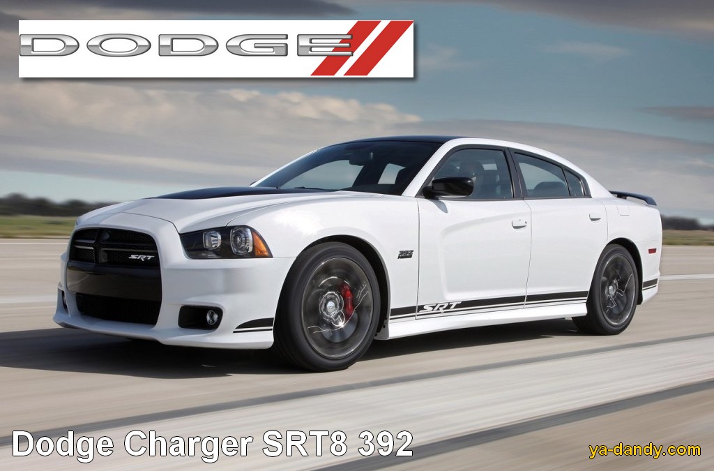 Currently Icon brands Dodge has a very simple design. The logo is the word "DODGE" with a pair of red slanted stripes. It can be seen on everyone more or less modern cars, For example, Dodge Charger SRT8.
An earlier version of the Dodge emblem was much more interesting. Until now, on many cars you can see the red head of a ram in a frame stylized as a shield. More specifically, this is the head of a bighorn, a powerful animal from the genus of sheep that lives in the mountains of the American continent and is famous for its massive, spiraling horns. According to one version, the Dodge emblem repeats the Dodge family crest. According to another, the Dodge icon means a stylized image of bizarre exhaust pipes the first cars of the brothers, similar to horns. And in addition, they symbolize the assertiveness and power inherent in bighorns.

Now this old Dodge logo is used only for Ram cars.
The emergence of the Jeep brand, and the legend of the mighty Jeep
Finally, let's talk about one more car brand, which by no means could not be ignored, this is the legendary Jeep(Jeep). Cars under this brand are produced by the same American corporation Chrysler as Dodge cars.
Powerful and comfortable Jeeps have long been the favorites of many men around the world. These cars are really different. the highest cross and power, but at the same time very comfortable and functional. Besides, Jeep SUVs- has long been an icon of male style, peculiar symbol"coolness".  Jeep badge
very simple, this is a truly "male" emblem - concise and strict. In fact, the Jeep logo is just an inscription ... Jeep! But with the origin of the name itself, everything is much more complicated. No one knows exactly where this word came from and what it means. But there are several interesting versions.
Jeep badge
very simple, this is a truly "male" emblem - concise and strict. In fact, the Jeep logo is just an inscription ... Jeep! But with the origin of the name itself, everything is much more complicated. No one knows exactly where this word came from and what it means. But there are several interesting versions.
According to one such version, "jeep" is an abbreviation for GPW. During the Second World War, special light military vehicles "Ford GPW" were produced. It is possible that the first two letters (G and P - "Jeep") subsequently became the name for a new generation of similar civilian vehicles.
According to another legend, by its name Jeep cars owe... to a comic book character! In the 1930s, comic books were published telling about the adventures of the animal Eugene Jeep. This funny and resourceful character was so popular that even a technique was named after him.
The third version is of the opinion that Jeep is short for "General Purpose". This is the name of the category of cars in the US Army general purpose where these cars belonged.
We are unlikely to know the truth. Yes, it does not matter, it is important that there are such amazing cars as Jeep!
That's all. Continuation of the story car icons there will be peace!
When copying an article or part of it, a direct link to