Today's post will be an excellent addition to the section. We have selected more than a hundred interesting works for you. All of them are taken from the English-language blog designyourway.net, the author of which writes about design, typography, user interfaces, wordpress, etc. One of the sections there is dedicated to logo collections. Most original solutions of these notes will be found below.
If you have to create a logo, but there are still no ideas for starting, then look at these logos for inspiration. Of course, you should not copy other people's work, but you can highlight some interesting techniques and approaches for yourself. These collections of logos do not have any common theme, such as in or, and the time frame for their creation is quite large. That is, at the very end you will find images drawn more than a few years ago. However, this does not prevent them from looking relevant and spectacular.

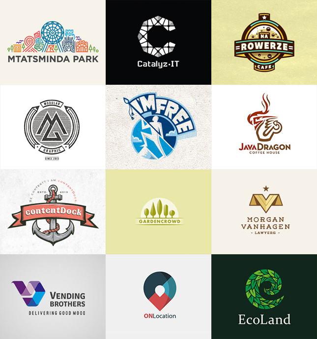
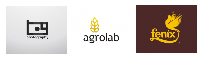
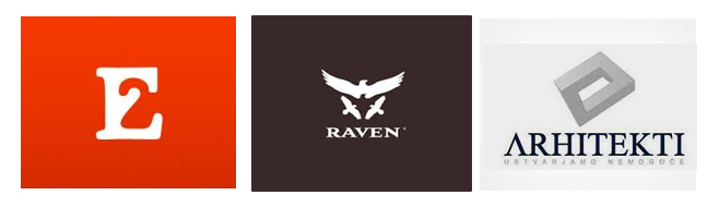
Often logos visually display (embody) the name of the company / product in the form of relevant objects, for example, Saturn Travel, Icecream Design, Cube, Badminton Academy. To be honest, it is not entirely clear whether these are real existing brands or just abstract works of designers. Sometimes this approach looks “subtle”, as in the case of Africa Online, sometimes eerily predictable - the Anchor Book logo.
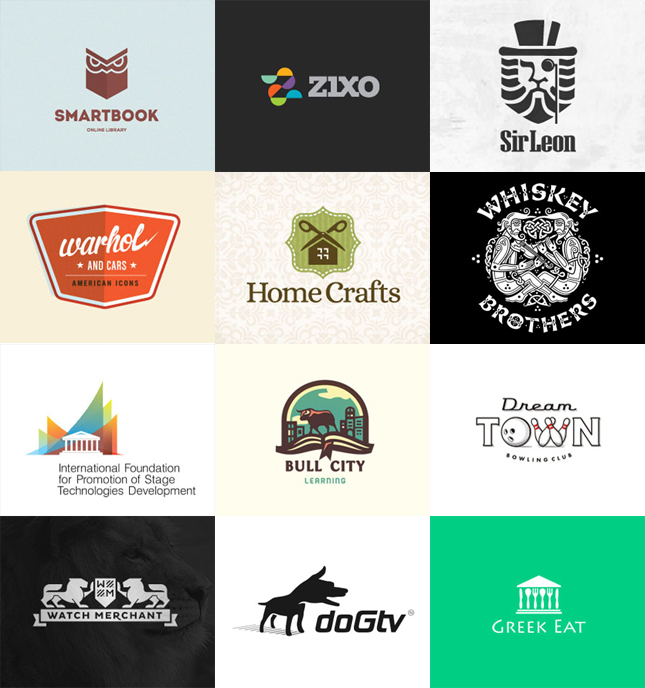
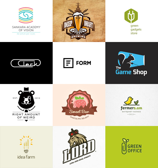
I personally like it when this or that graphic object in the logo is a kind of logical addition to the name, for example: Green Gadgets Store, Clerk, Green Office. Although, perhaps, this is a rather subjective opinion.
There are in this collection of logos visually very simple work, for example, the same Form, but due to its ideas, the drawing looks complete. While choosing a detailed logo with many details is also good decision in some cases. And it is not clear what is more difficult and longer in time - inventing and implementing original idea or the study of a dozen small details of the image.
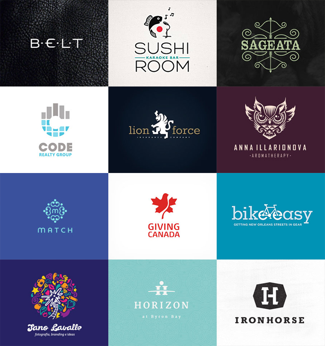
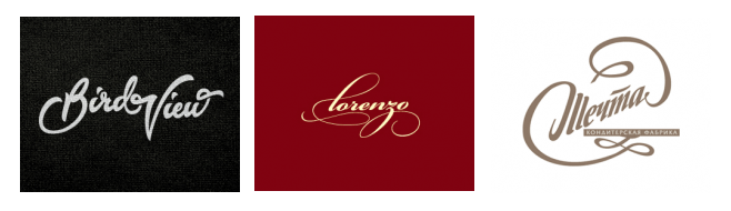
The background and colors have a strong enough impact on the perception of the logo. Replacing the background with black and white, the effect could have been completely different. At the same time, light substrates look somehow simpler, while a dark contrast image causes some kind of “dominant” effect with a strong accent. In some cases, like with Lion Force, I think it fits the idea and purpose. Fonts like Roar, Alegnor, Lord, IronHorse can have a similar “strong” effect.


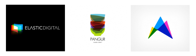
Among this collection of logos for inspiration, I like pictures with abstract objects the most: Vallory Miller, Wecarhitecten Branding, Vending Brorhers. They tend to use bright (sometimes even too colorful) colors. Works with three-dimensional elements also look beautiful: Mcfon, OnLocation, Norman, Dore Corp.
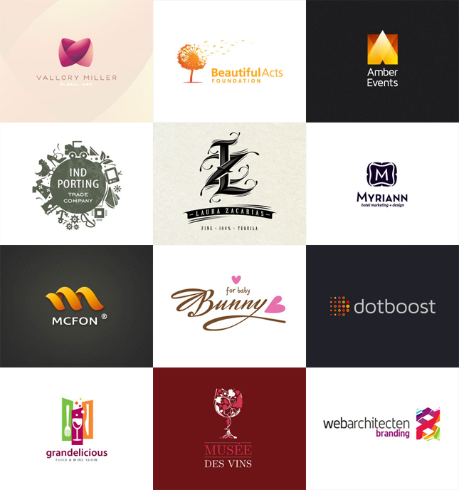
In general, there are enough worthy options. I hope this selection of logos for inspiration will be useful to you. In total, 120 original works with different styles, directions and design solutions were obtained.
When it comes to logos, many believe that they did not appear until the 19th century. In many ways, this is true. Trade and industrial companies, trying to distinguish their products from the competition, began to decorate the packaging - this is how branding appeared, of which logos are also a part. But if you think about it, you can come to the conclusion that the forerunner of modern logos is the ancient Greek drachma, a coin on which the ruler's profile was often minted. It was such a kind of personal branding and the ancient Greeks wouldn't be doing nonsense if the image of a leader on money didn't make sense. And it did, because it evoked associations, which is what a logo should do. In those distant times, the brand that artisans put on their goods also acted as a logo.
The first officially registered logo is a font trademark Bass beer. The British Patent Office registered it on January 1, 1876. Interesting fact: The beer, like its logo, still exists today. And ten years later, in 1886, the logo of another popular drink appeared - Coca-Cola, which has practically not changed over the entire period of its existence.
What should be the logo? Yes, whatever, if it is uniquely associated with the brand. It is desirable that it be universal, functional, scalable and, most importantly, concise. When we look at the Apple or Nike logos, we instantly recognize them, largely due to their simplicity. Moreover, we remember about computer technology, looking at a bitten apple and about sports shoes, when we look at an incomprehensible squiggle. This suggests that the universal logo always works. If it is uniquely associated with the brand, then it can be very minimalistic and still be remembered. Can three stripes remind you of a brand? Even as they can, just remember about Adidas.
Creating a simple logo is actually very difficult. It is not uncommon for designers to make dozens or even hundreds of variations of brand names and typefaces before they manage to capture the spirit of the brand. At the same time, many forget about brevity and versatility. Nice logo always simple, it scales well and looks good in black and white. Yes, that's the secret. If a one-color logo is poorly remembered, then it cannot be called successful. Therefore, experiments with color should be started only after the best black and white version has been found.
Work on creating a simple, concise logo should start using only two colors: black as the main color and white as the background color. Or vice versa. Colors, gradients or textures can be used after the concept of the logo has been found.
Doodles and squiggles
Whimsical design elements are on trend these days, so you can move in that direction by creating a minimalist logo design. Wavy lines can become part of the identity, especially if they go well with the typeface used for the brand or product name. A brand name created with intersecting wavy lines will work well even if there is no space left for the type part of the logo.

Line logos allow you to create your own style while avoiding accidental plagiarism. Such logos can be abstract, or they can reflect the nature of the company's activities, only one thing is important - they should not be too complicated. If the designer decides to use scribbles and squiggles, then he should try to avoid confusion in the lines, as such logos do not scale well. Being too small, they are not readable, and if the logo is enlarged too much, the distance between the lines will blur the image.
When creating a simple laconic logo, you need to immediately decide on the style. If there is any doubt about how well this or that typeface or sign will work, then it does not hurt to see how the logo will look on physical media. There are many layouts with which you can do this.

When choosing a trendy style, such as vintage, twist or lines, you need to remember that the logo is designed with an eye to perspective. Fashion is fashion, but the logo lives for a long time, its value only increases over the years, so it is better to choose a style that will be relevant in the coming years. However, this is not an axiom. If the brand develops successfully, even an out-of-fashion font or graphics will evoke the right associations. Nobody is embarrassed by the ancient font used for the name Coca-Cola. But still it is better not to chase fashion and choose a more respectable style.
Today, retro is in fashion. Creating a simple logo in this style is not a bad idea. But retro should be special, in each of the eras there are classic examples, so you need to use only those elements that people unambiguously associate with any time period. In minimalism, retro can be represented in different ways.
It can be a linear logo where the brand name is inscribed in a circle, but it is quite possible to create a vintage logo if you choose a massive font that was popular in the 70s of the last century. And if you add a little neon in the color version, it will remind you of the 80s of the twentieth century. It is very important to keep it concise. A simple retro logo should evoke the past, but it should also look great in a digital environment. A vintage logo should be modern, but not archaic.
simple shapes
Simple geometric shapes are great for creating minimalist logos. A simple form is easily recognizable, it works on its own, evoking certain associations, and the task of the designer is to strengthen the connection between the image and the brand. You can start with the simplest shapes: a circle, a square, or a triangle, and start building your complexion using one or more shapes.
What is the circle associated with? The circle has no beginning and end, so it reminds of continuous movement. For example, about a wheel or luminaries moving across the sky. The circle is neutral, but its nature is cyclical, which can evoke associations with love, energy or strength. The circle also symbolizes infinity and harmony.
The square evokes strong associations with stability and equality. This figure is stable and thus appeals to trust. If the logo should embody respectability and power, then a square can be used. However, it should be remembered that the square is used so often in the identity that it will be difficult to come up with something original. Brand names based on a square can look boring, as they can cause the viewer to associate with other images they have seen before.

The triangle is strange in many ways geometric figure. It is associated with energy, stability and strength, but only if one of the angles is pointing straight up. It is enough to tilt the triangle or turn it over, as the feeling of stability disappears. The figure will begin to be associated with conflict, tension and nervousness, the inverted triangle seems unstable, which subconsciously disturbs the viewer.
Another popular shape that is often used when creating minimalist logos is the cross. What is the cross associated with in the first place? Probably with religion, but the cross is also a symbol of balance, hope and health. This figure is quite neutral, but it should be used very carefully, not forgetting the characteristics of the audience.
Many designers, when working on a laconic logo, are tempted to embellish it a bit. But minimalism is what minimalism is: it does not and cannot have unnecessary elements. An entire carefully constructed concept can fall apart if the designer suddenly wants to make the sign or typeface more attractive. In the design process, you need to pay attention to the main thing and try to use fewer details. As soon as there is a desire to add an extra element, it is better to stop working and continue it later, when you can look at what has been done with a fresh eye.
It is necessary to strive to ensure that the logo is read the first time, this is how a good identity works. A minimalistic logo includes everything you need and does not need explanations and additions.
Conclusion
Minimalism is a style that does not depend on time. Fashion can change, one trend can replace another, and a laconic logo will work regardless of the change in era or environment. Simply because it is easy to remember, distinguish at a glance and immediately associate with a brand or product.
It is rare to find a logo related to a particular style, as a rule, each logo is a whole “invention” consisting of various layers of artistic styles.
- Cartouche, vignettes. Signs in which ornament is the key element can be identified as a separate style of abstract logos. Such logos imply an individual approach, elitism.
- Dots. A point is one of the simplest geometric elements. A composition created from many different points equidistant or distant from each other in any mathematical sequence can create complex and interesting compositions. Even simple shapes, created by means of points, acquire a new, original look.

- Drops. The shape of the drop is often played up in various variations. It is a mathematically beautiful and memorable form that will never get old. With the help of a drop, they convey naturalness, fluidity, a liquid base.
- Cubism. This art style originated in the early 20th century and is still occasionally used by graphic designers to give a clean, geometric look. Objects are divided into geometric primitives.

- simple geometry. Simple shapes are used, not complex geometric compositions. This technique is often used in concise corporate signs. Conciseness gives efficiency and seriousness to the sign. "Nothing extra" - can be read in these forms.

- Youth style. Logos bearing fashionable, modern images. These are active compositions, sometimes built on images from the past. Logos in youth style tell us about the endless possibilities for young and active people.
- Spiraling. The spiral is one of the simplest natural forms. This form is often found in the plant and animal kingdom. Designers have long taken note of the spiral and often use this style in logos.

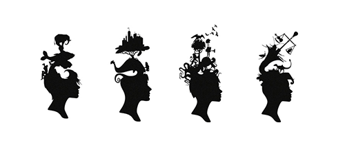
- prototypes of the animal world. Signs using the image of an animal are one of the most common. A logo made in this style carries the special qualities of the depicted animal.
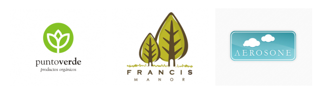
- Plants, green world. Such logos impose on us images of something natural, healthy, growing. The forms of "growing" logos are leaves, flowers, curly and straight stems. The "Plant Theme" logos do not have to be symbols of agricultural or other enterprises engaged in the production and cultivation of plant life forms. It is an image of everything developing and growing.
- The method of changing the shape, deformation. Modern technologies offer us more and more interactivity. This also applies to logos. Logos made by changing the shape look lively, modern and progressive. They seem to go "beyond" turning into 3D images.
- Human image. Logos that create the image of a person make us feel friendly. Signs containing elements of the human body: nose, mouth, eyes, ears, hair, arms and legs humanize the logo. The sign, as it were, comes to life, acquiring human features.

- Shadow solutions. Shadows are given a lot of attention in artistic activity. Logos are no exception. Signs take on almost real forms when they have a shadow. An illusion of space is created. Very often, the shadow in logos carries its own, separate, secondary meaning, complementing and reinforcing the first.
- Effects of transparency, illumination. Light brings warmth and energy to people. The use of "light effects" in logos gives us a positive attitude, optimism, warmth and good luck.
- Ecology. Ecology has recently been of great concern to man. This concern could not but be reflected in modern logos. Freshness, environmental friendliness, cleanliness and health in the signs of this style.
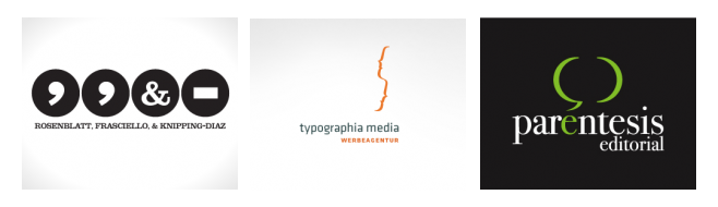
- Signs of writing. Signs: interrogative; exclamation point, dots, commas, brackets - all this has long been separated into a separate style for interesting logos. This is a fresh Internet, youth style.
- "Simple" style. Logos without intricacies and hidden meanings. What is written is written, what is written is shown. There is no need to think or fantasize. Very simple and clear logos.
- Photo images. Signs made in photorealistic style look very interesting. They seem to tell us: "We are real." Often they carry a pseudo-volume, a non-existent three-dimensionality.
- Ring. Logos using images of rings or their parts symbolize integrity, completeness, quality and high level company or services provided.
- Lines and ribbons. The logo, or part of it, is made in the form of a continuous line, uniting the entire sign into a single composition. Lines made with lines look original and intricate.

- Coat of arms logos. Logos made in this style look majestic and rich. Signs in style medieval coats of arms bear the imprint of the Middle Ages and inspire respect.

- Halfheartedness. The incompleteness of the logo arouses the interest of the observer. Half of the sign, as it were, asks us a question, what next, where is the second half? These are intriguing and interesting signs.
- Overlay layers. These are overlay images. They can be transparent or complement each other. This is an illusion that creates a plurality of meanings.
- Illusion of optical perception. One of the most interesting logo styles. It is based on the peculiarities of visual perception and tells the viewer: "we can do anything."
- Pixels. One of the latest trends. Signs that are divided into pixels bring digital technologies to our world. Breaking up into components, they reveal their interactive, "digital" essence. "Pixels" are popular for IT technologies.

- Calligraphy. Logos written in one stroke, as if “by hand” (very often this is true). They tell us about their uniqueness, elitism. Calligraphic logos are expressive and self-sufficient, very often without any visual mark.
- Ambigrams. Ambigrams are readable when turned over. Ambigram logos are the pinnacle of practicality modern design. The logo that is readable after it is turned upside down is worthy of attention.
- Drawn logos look interesting artistic and at the same time simple. Logos made in the style of illustrations tell us: “It costs nothing for us”, “We will make it easy for you”.

- Changeable forms. This is the embodiment of dynamism in the logo. Such a logo is too alive to exist in any one static form. While the logo retains its former meaning and basic form, it is constantly changing.